Holiday vs. Break Time Analysis Graph – Understanding Work Efficiency Through Statistics
RJ0300023_18
- Last Update 04/23/2025
- File Size 0.3MB
- # of Slides 2
- File Format PPTX
- Slide Ratio 16:9
- Color
Keywords
- #Content-Based Slides
- #Design-Based Slides
- #Product/Service Introduction
- #Market and Competitor Analysis
- #Graph
- #Development Status
- #Market Share
- #Circles
- #Doughnut Chart
- #16:9
- #donut pie chart PowerPoint
- #pie chart slide template
- #ratio comparison graph
- #circular graph PPT
- #statistical analysis slide
- #data visualization PowerPoint
About the Product
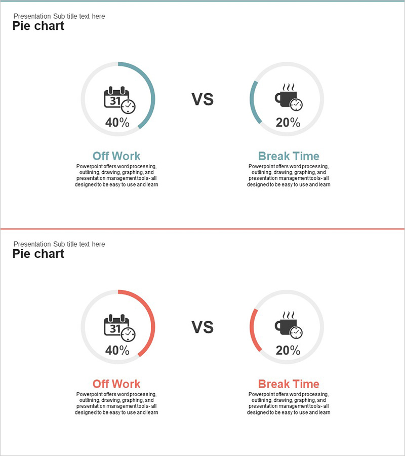
A donut pie chart PowerPoint slide that visually compares work efficiency between holidays and break time. The slide uses teal and red color contrasts to clearly represent comparative data, with icons and percentage values positioned alongside each segment for enhanced readability. The 2-slide set presents the same data in different color schemes, allowing flexible selection based on presentation context. This chart effectively communicates the proportion of each item relative to the whole through a circular graph format, making it ideal for statistical reports and data-driven presentations.
Usage Points
-
Main Usage
Visualize work efficiency analysis, compare holiday versus break time ratios, and present statistical data. The circular graph format intuitively conveys the proportion of each segment relative to the total, making it suitable for executive reports, marketing analysis, HR presentations, and performance reviews.
-
How to Use
Input your data values directly into the donut chart template for immediate use. Customize icons and labels to represent different comparison items (e.g., working hours vs. waiting time), and adjust color schemes to match your corporate branding or presentation theme.
-
Recommended For
Executives, managers, HR professionals, marketing teams, and data analysts. Ideal for presenting work efficiency analysis, employee satisfaction surveys, time allocation studies, and resource allocation reports. Suitable for organizational presentations, management meetings, and quarterly performance reviews requiring data-driven insights.
-
Slide Structure
2-slide set with centered donut pie chart (2-segment division) as the focal point. Icons, labels, and percentage values are positioned on both sides of the chart. First slide features teal accent color; second slide features red accent color, allowing selection based on presentation needs while maintaining consistent data representation.
Related Products
-

Analysis of Transportation Usage Status – Pie Chart
#Product/Service Introduction #Market and Competitor Analysis #Graph
-

Development Status Analysis Donut Chart – Market Share Visualization
#Product/Service Introduction #Market and Competitor Analysis #Graph
-

City Theme Market Share Graph – Business Data Visualization
#Product/Service Introduction #Market and Competitor Analysis #Graph
-

Stock Market Share Analysis Graph – Insights and Strategies
#Product/Service Introduction #Market and Competitor Analysis #Graph
