Geometric Pattern Wide PPT Radar Chart – Optimized for Market Analysis Visualization
RJ0200061_8
- Last Update 04/16/2025
- File Size 0.5MB
- # of Slides 2
- File Format PPTX
- Slide Ratio 16:9
- Color
Keywords
About the Product
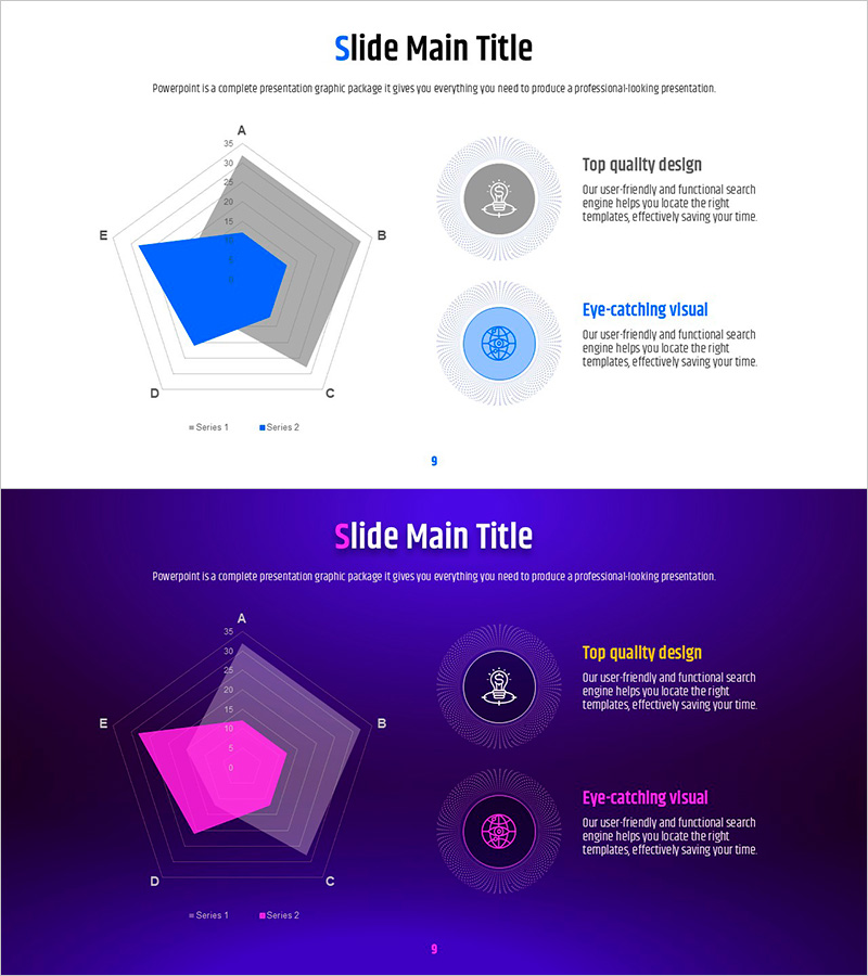
A radar chart PowerPoint slide comparing five data points across multiple dimensions using a radial visualization. Presented in dual-tone design with light background (white and light gray) and dark background (deep purple and magenta), featuring geometric pattern gridlines and numeric scales on each axis. Ideal for market analysis, competitive benchmarking, capability assessment, and performance metrics in professional presentations. The 2-slide set is fully editable and optimized for 16:9 widescreen format, ensuring compatibility with modern projectors and digital displays.
Usage Points
-
Main Usage
Visualizes multi-dimensional comparison of five data categories using a radial diagram structure. Effectively displays competitive strengths and weaknesses in market analysis, organizational capabilities, product features, or performance indicators simultaneously. Numeric scales on each axis enable precise quantitative comparison, while geometric pattern gridlines enhance data credibility and visual hierarchy.
-
How to Use
Use the light version for bright conference rooms and projector presentations; select the dark version for large auditoriums and online video presentations. Replace axis labels and numeric values with your analysis categories, and customize the fill colors (blue and magenta) to match your brand palette. The dual-series structure (Series 1 and Series 2) supports side-by-side competitive comparison.
-
Recommended For
Recommended for marketing and strategy teams presenting market analysis, sales teams reporting competitive intelligence, HR teams evaluating organizational capabilities, product teams comparing feature sets, and executive dashboards visualizing performance metrics. Particularly valuable for consulting, financial services, manufacturing, and IT industry presentations.
-
Slide Structure
Pentagon-shaped radial chart with five axes (A, B, C, D, E) extending from the center. Numeric scale (0–25) displayed in five concentric rings. Two data series represented in contrasting colors (blue and magenta) with filled polygon shapes for easy comparison. Right side includes two circular icons with accompanying text descriptions to support chart interpretation.
Related Products
-

Business Status Analysis Graph & Table – Visualization of Market Analysis
#Market and Competitor Analysis #Diagram #Graph
-

Green Red Comparative Radiograph – Visual Tool for Market Analysis
#Market and Competitor Analysis #Graph #Market Analysis
-

Residential Lighting Graph – Market Analysis
#Market and Competitor Analysis #Graph #Other
-

Visualizing Market Status and Analysis with Doughnut Charts - Utilizing Blue and Red
#Market and Competitor Analysis #Graph #Market Status
