Visualizing Market Status and Analysis with Doughnut Charts - Utilizing Blue and Red
RJ0400020_25
- Last Update 05/23/2025
- File Size 0.2MB
- # of Slides 2
- File Format PPTX
- Slide Ratio 16:9
- Color
Keywords
- #Content-Based Slides
- #Design-Based Slides
- #Market and Competitor Analysis
- #Graph
- #Market Status
- #Market Analysis
- #Circles
- #Doughnut Chart
- #16:9
- #doughnut chart PowerPoint
- #pie chart presentation slide
- #circular graph template
- #market analysis visualization
- #proportion data chart
- #donut chart slide download
About the Product
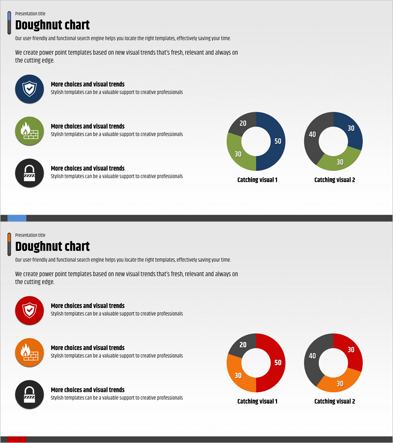
A 2-slide PowerPoint presentation set featuring doughnut charts for visualizing market status and analytical data. The doughnut charts use a four-color palette of blue, red, green, and gray to represent proportional data and component breakdowns intuitively. Each slide displays two doughnut charts with three segments each, accompanied by text description areas and icon elements. Ideal for business presentations, market analysis reports, and marketing proposals where you need to show market share, customer composition, or sales distribution. Delivered in 16:9 widescreen PPTX format, fully editable in all PowerPoint versions.
Usage Points
-
Main Usage
Optimized for expressing proportions and part-to-whole relationships such as market share, customer demographics, sales distribution, and budget allocation. The hollow center of the doughnut chart allows you to place key metrics or titles for emphasis, making it effective for comparing multiple data series simultaneously.
-
How to Use
Input actual numerical values into the doughnut chart segments and update the legend accordingly. You can maintain the existing blue, red, green, and gray color scheme or customize it to match your corporate brand colors. Add your analysis content to the text description area and incorporate additional icons to enhance visual impact.
-
Recommended For
Recommended for marketing professionals presenting market analysis results, sales teams explaining customer composition, finance teams visualizing budget distribution, and executive reports showing business unit proportions. Suitable for quarterly and annual performance analysis presentations.
-
Slide Structure
Both slides follow an identical layout structure. Each slide features three icons with text descriptions on the left side and two 3-segment doughnut charts on the right. The doughnut charts are divided into four color segments (blue, red, green, gray) with numerical labels displayed in the center. Designed in 16:9 widescreen format.
Related Products
-

Graph of Sales by Region – Visualizing Market Status
#Market and Competitor Analysis #Graph #Other
-

Stylish Design Business Presentation Template
#Market and Competitor Analysis #Graph #Market Status
-

Real Estate Performance Status Donut Graph – Essential for Market Analysis
#Market and Competitor Analysis #Graph #Market Status
-

Idea Presentation Template Wide – Market Analysis and Visualization
#Market and Competitor Analysis #Graph #Other
