Abstract Pattern Presentation Radar Chart – Emphasizing Marketing Strategy
RJ0200033_15
- Last Update 04/07/2025
- File Size 0.3MB
- # of Slides 2
- File Format PPTX
- Slide Ratio 16:9
- Color
Keywords
- #Content-Based Slides
- #Design-Based Slides
- #Marketing Plan and Strategy
- #Financial Plans and Performance
- #Diagram
- #Graph
- #Marketing Objectives
- #Tax Strategy and Benefits
- #Table
- #Other
- #Standard Table
- #Radar Chart Spider Chart
- #16:9
- #radar chart PowerPoint
- #5-axis diagram slide
- #marketing performance analysis PPT
- #multidimensional data visualization
- #how to create radar chart in PowerPoint
About the Product
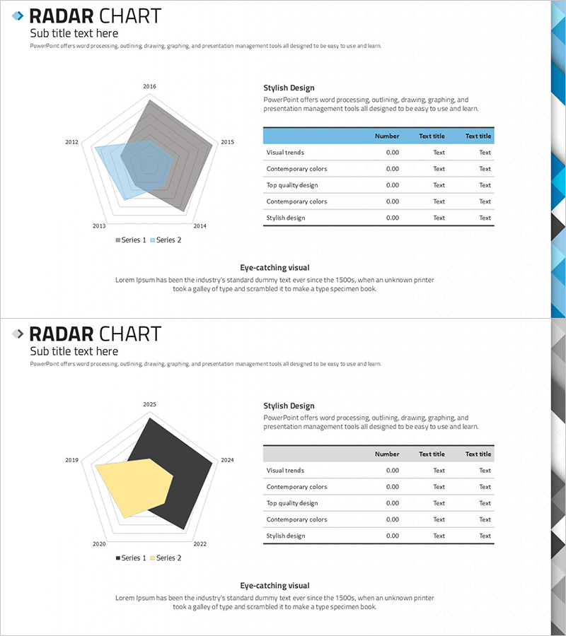
A 2-slide PowerPoint set featuring a 5-axis radar chart for multidimensional data comparison. Ideal for marketing strategy, financial performance, and competitive analysis presentations. The design uses light blue and gray transparent layers to visualize time-series data (2012–2016) with accompanying data tables for precise numerical reference. Fully editable slides in 16:9 widescreen PPTX format, ready for immediate use in presentations and slide decks.
Usage Points
-
Main Usage
Compare and analyze 5 or more metrics simultaneously, such as marketing strategy, financial performance, competitive strength, and organizational capabilities. Layer multiple data series to show trends and changes over time in an intuitive, visually compelling format.
-
How to Use
Slide 1 features a light blue transparent-layer radar chart; Slide 2 uses gray tones with multi-series structure. Edit axis labels and data values to match your analysis metrics. Input numerical data into the accompanying table for automatic chart synchronization.
-
Recommended For
Marketing managers, strategic planners, financial analysts, executives preparing performance reports, consulting firms, and business development teams. Suitable for business plans, quarterly performance reports, competitive analysis presentations, and strategic reviews.
-
Slide Structure
Two 5-axis radar charts with distinct color schemes (light blue and gray) featuring 2–3 overlapping data series. Each slide includes legend, axis labels, and data table with sample time-series data (2012–2016) for reference and customization.
Related Products
-

Marketing 4P Hierarchy Diagram
#Marketing Plan and Strategy #Diagram #Marketing Objectives
-

Summary Table of Energy Saving Outcomes
#Market and Competitor Analysis #Financial Plans and Performance #Diagram
-

Radar Charts and Tables – Market Analysis and Comparison
#Product/Service Introduction #Market and Competitor Analysis #Diagram
-

Business Plan Presentation Template - Radial Diagram & Table
#Market and Competitor Analysis #Financial Plans and Performance #Diagram
