Horizontal Bar Chart for Customer Analysis – Segment Design
RJ0200029_14
- Last Update 04/05/2025
- File Size 0.2MB
- # of Slides 2
- File Format PPTX
- Slide Ratio 16:9
- Color
Keywords
About the Product
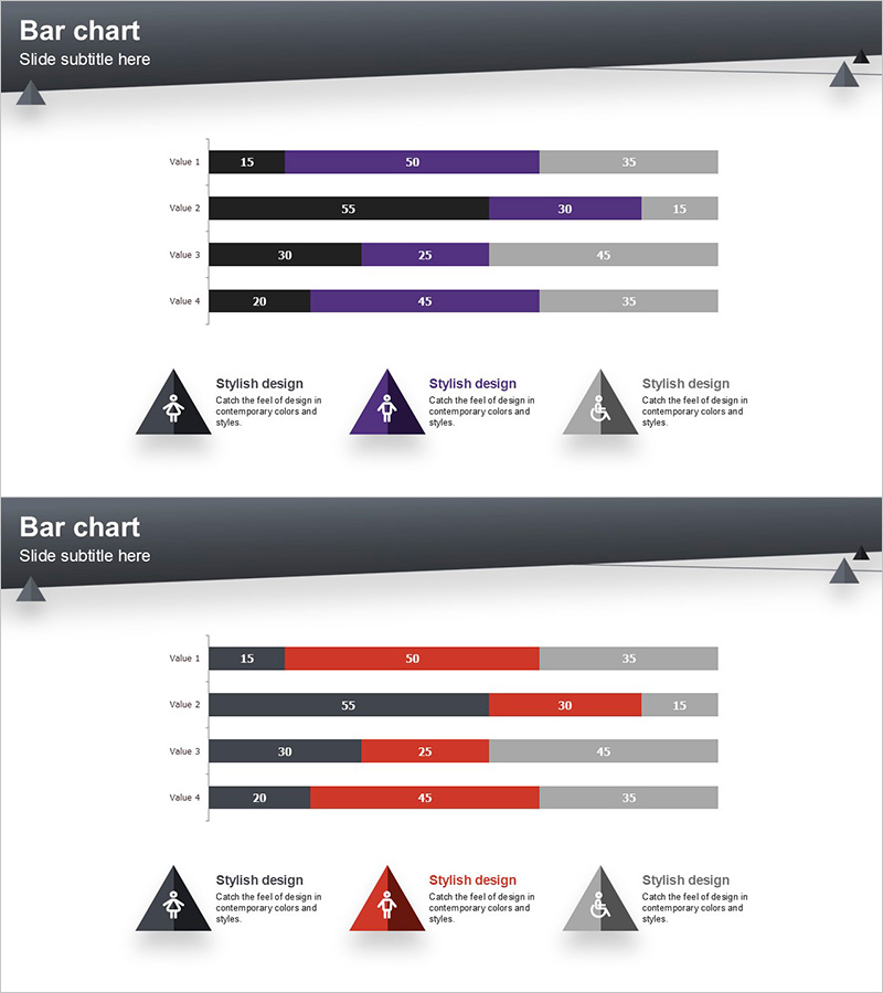
A horizontal bar chart PowerPoint slide optimized for customer analysis and market research presentations. This segmented chart design uses three color series (black, purple, and gray) to display multiple data points per item simultaneously, enabling comprehensive multi-level comparisons. The 2-slide set includes two color variations—one with purple accent and another with red accent—allowing you to select the most suitable palette for your presentation context. Compatible with 16:9 widescreen format, these slides are ready for immediate data input and professional delivery.
Usage Points
-
Main Usage
Ideal for visualizing customer segmentation, market analysis, and sales data comparisons. Each item displays 3–4 sub-metrics in parallel, making it highly effective for presenting complex, multi-dimensional datasets at a glance.
-
How to Use
Simply replace the bar lengths and numerical values with your actual data. Choose the color scheme (purple or red accent) that best matches your presentation theme and emphasis, then customize the labels as needed.
-
Recommended For
Perfect for marketing professionals, sales analysts, executive reports, consulting proposals, and academic presentations when communicating customer segmentation, market share, sales performance, or survey results with visual impact.
-
Slide Structure
Each slide contains 4 rows (Value 1–4), with each row displaying 3 segmented series arranged in stacked or parallel layout. Three triangular icons with descriptive text at the bottom serve as a legend for the data series.
Related Products
-

Male-Female Ratio Graph Chart – Essential Tool for Customer Analysis
#Market and Competitor Analysis #Graph #Customer Analysis
-

Manpower Analysis Bar Chart – Optimal Solution for Data Visualization
#Company Introduction #Market and Competitor Analysis #Graph
-

User Analysis Status by Year – Growth and Change
#Product/Service Introduction #Market and Competitor Analysis #Graph
-

Visualizing Menu Sales Trends with Horizontal Bar Graph
#Market and Competitor Analysis #Financial Plans and Performance #Graph
