Manpower Analysis Bar Chart – Optimal Solution for Data Visualization
RJ0600065_5
- Last Update 07/07/2025
- File Size 0.3MB
- # of Slides 2
- File Format PPTX
- Slide Ratio 16:9
- Color
Keywords
- #Content-Based Slides
- #Design-Based Slides
- #Company Introduction
- #Market and Competitor Analysis
- #Graph
- #Manpower
- #Customer Analysis
- #Horizontal Bar
- #Segmented Horizontal Bar
- #16:9
- #horizontal bar chart PowerPoint
- #manpower analysis slide template
- #data comparison presentation
- #bar graph slide download
- #numerical data visualization PPT
About the Product
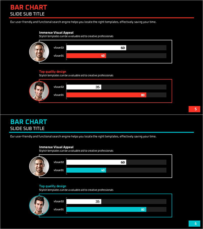
A horizontal bar chart PowerPoint slide designed for manpower analysis and comparative performance evaluation. This data visualization template features a black background with red and blue accent colors to contrast two data series (value01 and value02) for each item. Each section includes a profile image and numerical labels, making it ideal for presenting personnel metrics, customer satisfaction scores, or performance indicators. The 2-slide deck in 16:9 widescreen format is fully editable, allowing you to input data and automatically update the chart visualization for immediate use in presentations.
Usage Points
-
Main Usage
Visualize comparative metrics such as organizational headcount, customer satisfaction ratings, or performance benchmarks across two data series. The bar length intuitively represents numerical differences, making it effective for presenting personnel comparisons, team performance metrics, or departmental KPI analysis.
-
How to Use
Enter value01 and value02 numbers for each item, and the bar lengths automatically adjust proportionally. Replace profile images with relevant photos, update item names and descriptions to match your presentation context, and customize text labels as needed.
-
Recommended For
HR department workforce reports, sales team performance comparisons, marketing customer analysis presentations, executive performance dashboards, consulting proposal benchmarking sections, and organizational metrics briefings.
-
Slide Structure
2-slide template with profile image placeholder, dual horizontal bars per item, numerical value labels, black background with red and blue accent colors, 16:9 widescreen format, fully editable PPTX with all elements customizable.
Related Products
-

Horizontal Bar Charts for Customer Analysis – Summer Vacation Template
#Market and Competitor Analysis #Graph #Other
-

Cover Slide for Numerical Analysis by Customer Insights
#Market and Competitor Analysis #Graph #Customer Analysis
-

User Analysis Status by Year – Growth and Change
#Product/Service Introduction #Market and Competitor Analysis #Graph
-

Customer Type Analysis Bar Graph – Data Visualization for Customer Success
#Company Introduction #Market and Competitor Analysis #Customer Success Stories
