Online Presentation Template Line Chart – Market Trends and Visualization
RJ0200025_17
- Last Update 04/04/2025
- File Size 3.2MB
- # of Slides 2
- File Format PPTX
- Slide Ratio 16:9
- Color
Keywords
About the Product
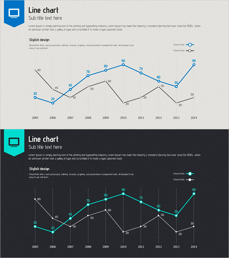
A professional line chart PowerPoint slide comparing two data series across a 10-year period from 2005 to 2014. The slide features a blue line and a black line representing two distinct metrics, with clearly marked data points at each year. A light gray background with vertical gridlines ensures easy data readability and professional presentation quality. This slide template is ideal for business presentations, financial reports, market analysis, and performance reviews where trend comparison is essential. The 16:9 widescreen format with 2-slide set accommodates modern presentation environments and allows immediate customization.
Usage Points
-
Main Usage
Visualize and compare the progression of two related metrics over time, enabling stakeholders to identify trends, patterns, and performance gaps. Ideal for demonstrating growth trajectories, market shifts, or comparative performance between two business indicators.
-
How to Use
Insert your data values into the chart by clicking on data points or using the data table function. The chart automatically updates to reflect your numbers. Use in annual reports, quarterly business reviews, investor presentations, and strategic planning sessions to support data-driven discussions.
-
Recommended For
Finance teams presenting quarterly/annual results, marketing departments analyzing campaign performance, executives comparing competitive metrics, consultants presenting market analysis, and investors reviewing business performance. Suitable for board meetings, stakeholder updates, and formal business presentations.
-
Slide Structure
X-axis displays years 2005-2014 (10 data points). Y-axis ranges from 0 to 90. Blue series peaks at 90 in 2010; black series peaks at 60 in 2009. Two legend entries (Visual Trend 1 and 2). Vertical gridlines aid precise value reading. Clean layout with ample white space.
Related Products
-

Market Trends and Competitor Analysis Chart – Emphasizing Future Outlook
#Market and Competitor Analysis #Graph #Future Outlook
-

Current Status and Prospects of Cultivation – Market Analysis Graph
#Market and Competitor Analysis #Graph #Future Outlook
-

Camera and Line Chart Comparison - Market Trends and Future Outlook
#Market and Competitor Analysis #Graph #Other
-

Line Graph for Market Trend Analysis – Insights for Education
#Market and Competitor Analysis #Graph #Future Outlook
