Quality PowerPoint Wide Template Area Chart
RJ0200020_5
- Last Update 04/03/2025
- File Size 6.3MB
- # of Slides 2
- File Format PPTX
- Slide Ratio 16:9
- Color
Keywords
- #Content-Based Slides
- #Design-Based Slides
- #Risk Management and Regulatory Compliance
- #Graph
- #Other
- # Risk Management Strategy
- #Other
- #Area Chart
- #Silhouette
- #16:9
- #area chart PowerPoint
- #area graph template
- #dual-series trend slide
- #data visualization PowerPoint
- #how to create area chart in PowerPoint
About the Product
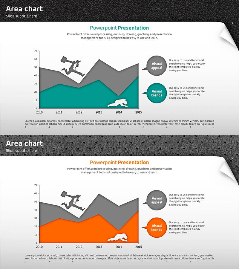
A PowerPoint slide featuring a dual-series area chart that visualizes data trends from 2010 to 2015 using orange and gray colored areas. Silhouette icons are positioned above each data series to enhance visual distinction and engagement. This presentation template is ideal for displaying comparative trends such as sales performance, market growth, or performance metrics across multiple categories. The slide is ready to edit and integrate into business reports, quarterly reviews, and strategic presentations with immediate impact.
Usage Points
-
Main Usage
Visualize cumulative or comparative trends of two or more data series over time using stacked or overlapping area charts. Effectively communicate sales growth, customer acquisition, market share evolution, or performance metrics to stakeholders and decision-makers.
-
How to Use
Replace sample data with your actual figures; the area chart updates automatically. Modify axis labels, legend text, and data ranges to match your presentation context. Adjust colors and transparency as needed to align with your brand guidelines.
-
Recommended For
Business performance reports, quarterly earnings presentations, market analysis decks, financial forecasts, investor pitch decks, and strategic planning sessions. Ideal for C-suite briefings, board meetings, and stakeholder communications requiring data-driven insights.
-
Slide Structure
Horizontal axis displays years (2010–2015) with vertical axis showing numerical scale (0–70). Two stacked area series in orange and gray represent distinct data categories. Silhouette icons above each series provide visual anchors, while circular callout boxes on the right highlight key insights and trends.
Related Products
-

Application Chart Template – Market Analysis and Risk Management
#Market and Competitor Analysis #Risk Management and Regulatory Compliance #Graph
-

Modern Business Presentation Template Doughnut Chart1 – Visualizing Performance and Strategy
#Business Strategy #Risk Management and Regulatory Compliance #Graph
-

Summary of 4 Key Provisions – Efficient Operational Planning
#Operational Plan #Diagram #Other
-

Branching Strategy Design Slide – Business Vision and Strategy
#Business Vision and Strategy #Diagram #Other
