Structure Template - Effective Market and Competitor Analysis Using Diagram3
RJ0200018_12
- Last Update 04/02/2025
- File Size 1.2MB
- # of Slides 2
- File Format PPTX
- Slide Ratio 16:9
- Color
Keywords
- #Content-Based Slides
- #Design-Based Slides
- #Operational Plan
- #Market and Competitor Analysis
- #Diagram
- #Organizational Structure and Staffing Plan
- #Customer Analysis
- #Flow
- #Multidirectional Flow
- #16:9
- #directional arrow diagram PowerPoint
- #four-way diagram slide template
- #market analysis presentation
- #competitor analysis PPT
- #radial diagram PowerPoint download
About the Product
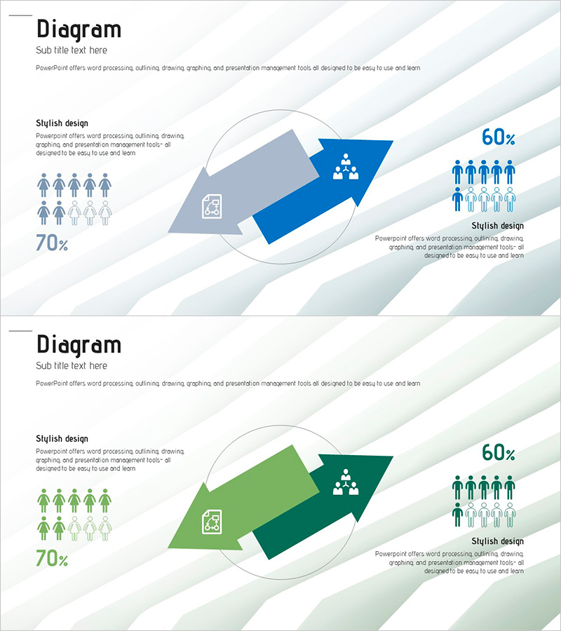
A directional arrow diagram PowerPoint slide designed for market and competitor analysis presentations. The slide features a central circular node with four arrows radiating outward in all directions, enabling simultaneous visualization of multiple analytical elements. Available in two color versions—blue and green—each slide includes people icons, percentage indicators, and designated text areas for data entry. Ideal for organizational structures, market positioning, competitive strategy comparisons, and multi-perspective analysis in business presentations.
Usage Points
-
Main Usage
Visualizes analytical elements radiating from a central concept in four directions. Optimized for expressing multiple perspectives simultaneously—market analysis, competitive comparison, organizational structure, and strategic planning—in a single integrated diagram.
-
How to Use
Enter your core topic in the central circular node and place analysis items in the four directional arrow zones. Use people icons and percentage indicators to represent organizational scale, market share, performance metrics, or comparative data across departments.
-
Recommended For
Executives, marketing teams, strategy planners, and consultants presenting market conditions, competitive positioning, and organizational role distribution. Suitable for business plans, marketing strategy documents, and strategic analysis sections of corporate presentations.
-
Slide Structure
Two-slide set. Each slide features a central circular node with four arrows extending in cardinal directions (up, down, left, right). Left side displays five people icons labeled 70%, right side shows four people icons labeled 60%, enabling side-by-side comparative data visualization.
Related Products
-

Global Service Strategy Diagram – Innovative Operation Plan
#Product/Service Introduction #Operational Plan #Diagram
-

Target Behavior Analysis: Children and Seniors Slide
#Product/Service Introduction #Market and Competitor Analysis #Diagram
-

Contrasting Reactions and Results
#Operational Plan #Market and Competitor Analysis #Text Box
-

Kids and Learning Infographics – Creative Learning Tools
#Market and Competitor Analysis #Diagram #Customer Analysis
