Simple Circle Presentation Template Pie Chart – Market and Product Status
RJ0200013_22
- Last Update 10/01/2025
- File Size 0.4MB
- # of Slides 2
- File Format PPTX
- Slide Ratio 16:9
- Color
Keywords
About the Product
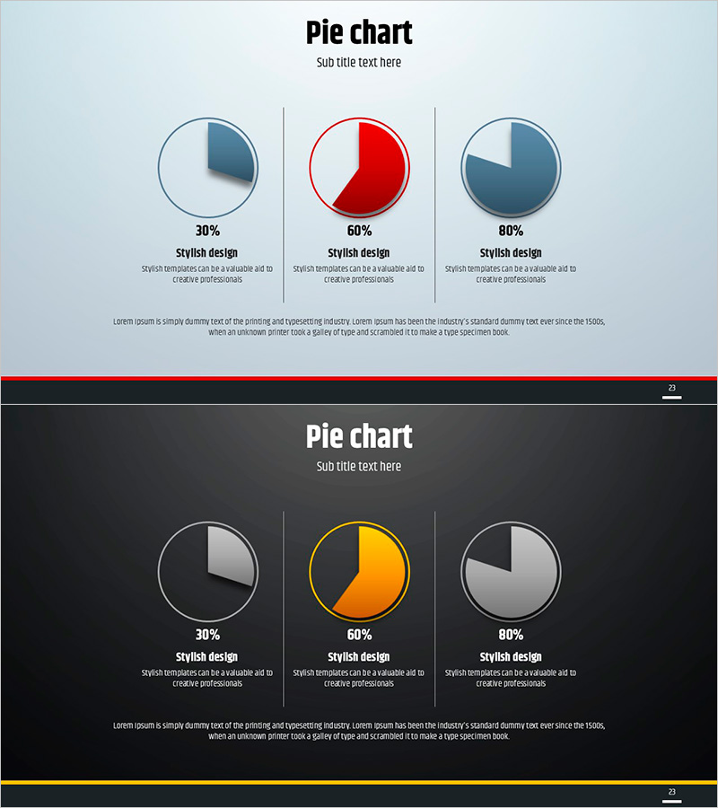
This free pie chart PowerPoint slide comes in two color themes: a light version with a soft blue-gray gradient background and a dark version with a deep charcoal background. Both versions feature three 3D pie charts arranged in an equal three-column layout divided by vertical separator lines. The center chart is highlighted in red on the light version and in orange-yellow on the dark version, drawing attention to the key data point. Each chart includes a percentage value, a subtitle, and a description text area below it, giving you nine editable text fields plus one full-width description area at the bottom. This presentation slide is ideal for visualizing market share, product composition ratios, survey results, or any percentage-based comparison data. Simply replace the numbers and text with your own data to complete the slide. If you need a wider variety of graph slides, explore GoodPello's premium graph slide collection.
Usage Points
-
Main Usage
Designed to visualize and compare up to three percentage-based data points side by side using 3D pie charts, making it ideal for market share analysis, product composition breakdowns, and survey result presentations.
-
How to Use
Choose either the light or dark theme to match your presentation style, then replace the percentage values, subtitles, and description text in each of the three columns with your actual data. Place the most important data point in the center chart to leverage the built-in color highlight.
-
Recommended For
Suited for business analysts, marketers, startup founders, and consultants who need to present ratio or proportion data clearly in market analysis reports, pitch decks, product presentations, or business plan slides.
-
Slide Structure
Single-slide layout with three 3D pie charts arranged in a three-column grid separated by vertical lines. Each column includes a percentage label, bold subtitle, and description text area (9 text fields total), plus one full-width description area at the bottom. Available in light and dark color themes.
Related Products
-

Competitor Analysis and Market Trend Graph – Blue, Orange, Green Colors
#Free Graphs
-

Competitive Advantage Bar General Graph – Emphasizing Performance through Market Analysis
#Free Graphs
-

Data Visualization with Bar Charts – Presentation for Efficient Choices
#Free Graphs
-

Market Analysis by Year Horizontal Bar Graph
#Free Graphs
