Product-wise Vertical Bar Chart and Analysis - Market and Competitive Analysis
RB0800074_8
- Last Update 03/28/2025
- File Size 0.1MB
- # of Slides 2
- File Format PPTX
- Slide Ratio 4:3
- Color
Keywords
- #Content-Based Slides
- #Design-Based Slides
- #Market and Competitor Analysis
- #Financial Plans and Performance
- #Graph
- #Competitive Advantage
- #Sales and Revenue
- #Line
- #Line Chart
- #4:3
- #bell curve chart PowerPoint
- #area graph slide template
- #data distribution visualization
- #market analysis slide
- #competitive analysis chart
About the Product
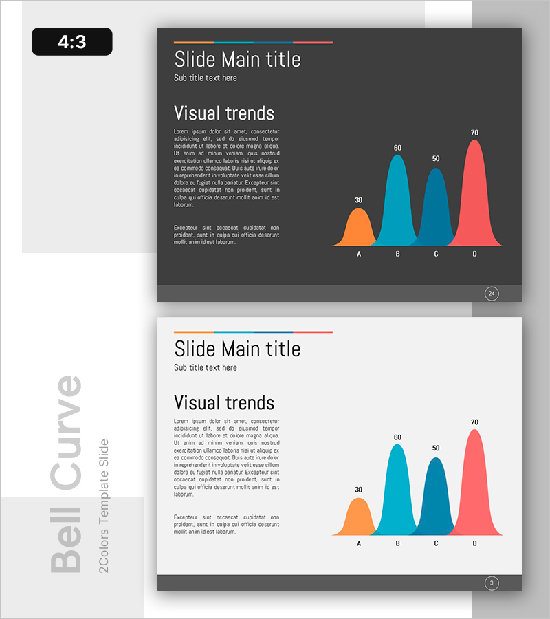
A PowerPoint slide template optimized for market analysis and competitive comparison using bell curve distribution visualization. The area chart features four data series in orange, cyan, teal, and coral colors, with numerical values (30, 50, 60, 70) labeled above each curve to emphasize quantitative comparison. The left text panel provides space for detailed analysis narrative, while the right side displays the distribution curves. This 4:3 ratio, 2-slide deck is ready for immediate use in presentations, reports, and business proposals. All colors, data values, and text are fully editable to match your specific analysis.
Usage Points
-
Main Usage
Visualizes multiple data series distributions simultaneously for market analysis, competitive benchmarking, and product performance evaluation. The four bell curves represent items A, B, C, and D, allowing viewers to instantly grasp relative magnitudes and distribution patterns for data-driven decision making.
-
How to Use
Replace the left-side placeholder text with your analysis context, market overview, and competitive strategy. Update the graph's four series colors and numerical values with your actual data. Modify the title and subtitle, then insert into presentations, reports, or business plans to strengthen data-backed arguments.
-
Recommended For
Marketing, strategy, and finance professionals analyzing market size, customer distribution, and revenue trends. Ideal for executive briefings, investor pitch decks, and business planning sessions where complex multi-series data must be communicated clearly.
-
Slide Structure
Title and subtitle area at top, left text panel with two paragraph input spaces, right-side bell curve distribution chart with 4 series (orange, cyan, teal, coral) and numerical labels. 4:3 aspect ratio, 2-slide consistent layout.
Related Products
-

Sales Trend by Division – Performance Insights
#Market and Competitor Analysis #Financial Plans and Performance #Graph
-

Graph Analysis by Year Sales
#Market and Competitor Analysis #Financial Plans and Performance #Graph
-

Sales and Net Income Graph – Visualizing Business Performance
#Market and Competitor Analysis #Financial Plans and Performance #Graph
-

Slide Visualizing Sales Performance Trend in the Kids Market
#Market and Competitor Analysis #Financial Plans and Performance #Graph
