Compact Data Visualization Slide - Analysis and Insights
RB0800054_8
- Last Update 03/26/2025
- File Size 0.5MB
- # of Slides 2
- File Format PPTX
- Slide Ratio 4:3
- Color
Keywords
- #Content-Based Slides
- #Design-Based Slides
- #Market and Competitor Analysis
- #Diagram
- #Graph
- #Market Status
- #Market Overview
- #Table
- #Circles
- #Standard Table
- #Pie Chart
- #4:3
- #pie chart PowerPoint slide
- #circular chart template
- #data visualization slide
- #ratio comparison PPT
- #market analysis chart
- #how to create pie chart in PowerPoint
About the Product
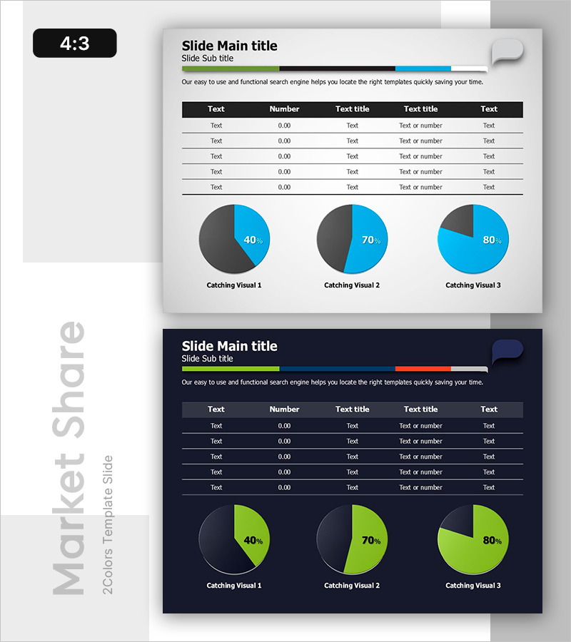
A professional pie chart PowerPoint slide designed for market analysis and data insights presentation. This template features two design variations with light and dark backgrounds, each containing three pie charts displaying different data ratios. The charts use contrasting blue and green color schemes to clearly represent proportions such as 40%, 70%, and 80%. Integrated with a data input table, this slide enables quick visualization of numerical information and is ready for immediate use in analytical presentations.
Usage Points
-
Main Usage
Effectively visualize part-to-whole relationships such as market share, sales distribution, and composition percentages. The three-chart layout enables simultaneous comparison of multiple data sets, making it ideal for presenting quantitative analysis results with clarity and impact.
-
How to Use
Enter numerical data into the integrated table, and the pie charts automatically update to reflect the values. Use the light background version for projector presentations and the dark background version for digital presentations or printed materials. All chart colors and proportions are fully editable to match your brand guidelines.
-
Recommended For
Marketing analysis reports, business performance reviews, market research presentations, financial status updates, customer satisfaction surveys, and any data-driven presentation requiring ratio visualization. Particularly effective for executive briefings, investor presentations, and quarterly performance reports.
-
Slide Structure
Slide 1 (Light Background): Title area + descriptive text + 5-row data table + 3 pie charts with 40%, 70%, 80% ratio displays. Slide 2 (Dark Background): Identical layout with green-toned pie charts. Each chart uses a two-color split design (primary and secondary colors) to maximize contrast and visual impact.
Related Products
-

Market Overview with Pie Charts and Tables
#Market and Competitor Analysis #Diagram #Graph
-

Key Statistics Overview Slide – Market Analysis and Competitive Context
#Market and Competitor Analysis #Diagram #Graph
-

Chart Analysis of Aerobic Exercise – Market Share Visualization
#Market and Competitor Analysis #Diagram #Graph
-

Market Overview PowerPoint Slide – Two Panel Market Analysis
#Market and Competitor Analysis #Graph #Market Status
