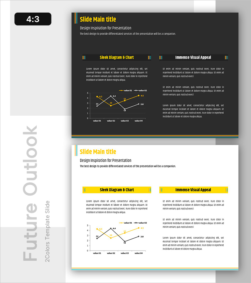
Trends Visualized with Line Chart
RB0800025_19
- Last Update 03/23/2025
- File Size 0.2MB
- # of Slides 2
- File Format PPTX
- Slide Ratio 4:3
- Color
Keywords
- #Content-Based Slides
- #Design-Based Slides
- #Technical Approach
- #Market and Competitor Analysis
- #Graph
- #Future Development Roadmap
- #Future Outlook
- #Line
- #Line Chart
- #4:3
- #line chart PowerPoint
- #trend analysis presentation
- #market trends slide
- #data visualization PPT
- #competitive analysis chart
- #line graph template download
About the Product
A PowerPoint slide template visualizing data changes across two series using a line chart design. The dark background with yellow accent color creates high contrast for clear presentation of numerical trends and comparisons. Displays four data points or quarterly periods with dual-series trend lines for comparative analysis. Ideal for business presentations including market trends, competitive analysis, and future outlook forecasts. Ready-to-use PPT slide set for immediate deployment in professional presentations.
Usage Points
-
Main Usage
Compares numerical changes and trends across two data series over time, ideal for visualizing market dynamics, revenue trends, competitive performance, and future projections in business decision-making contexts.
-
How to Use
The yellow accent lines stand out against the dark background, drawing audience attention during presentations. Simply input data values at four time points and modify series labels for immediate use without additional design work.
-
Recommended For
Executive reports, business plans, marketing strategies, investor pitch decks, quarterly performance reviews, and financial forecasts. Suitable for finance, retail, IT, and manufacturing industries requiring data-driven analysis presentations.
-
Slide Structure
2-slide set with identical line chart structure: first slide features dark background, second slide uses light background. Both contain dual-series line graphs with four data points and legend. 4:3 aspect ratio, fully editable PPTX format with all elements customizable.
Related Products
-

The Curve of Football Development - Market Analysis and Future Outlook
#Technical Approach #Market and Competitor Analysis #Graph
-

Current Status and Prospects of Construction Business – Insightful Analysis
#Technical Approach #Market and Competitor Analysis #Graph
-

Analysis of Sales Growth Segments Slide
#Technical Approach #Market and Competitor Analysis #Diagram
-

Visualizing Market Analysis with Modern Blue Line Chart – Digital Marketing Strategy
#Market and Competitor Analysis #Graph #Other
