Simple Line Chart – Contrast of Blue and Orange
RB0800019_13
- Last Update 03/21/2025
- File Size 2.5MB
- # of Slides 2
- File Format PPTX
- Slide Ratio 4:3
- Color
Keywords
About the Product
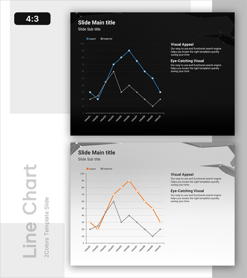
A dual-series line chart PowerPoint slide that visualizes data trends across two metrics over time. The dark background contrasts blue and orange line series, making it easy to compare 10 data points and identify performance differences. Legend indicators for Expert and Beginner levels help segment audience understanding. Text area on the right side allows for adding chart interpretation and key insights. This 4:3 ratio, 2-slide template is ready to edit and use immediately in presentations.
Usage Points
-
Main Usage
Ideal for comparing two key metrics over time and highlighting performance gaps. Effectively visualizes time-series data such as sales figures, visitor counts, or growth rates, enabling audiences to quickly grasp trend patterns and comparative insights.
-
How to Use
Replace chart data values with your own figures and add key findings or analysis in the right-side text area. The dark background ensures excellent readability in projector environments. Perfect for business reports, analytical presentations, performance reviews, and quarterly comparisons.
-
Recommended For
Financial analysts, marketing managers, project managers, and executives presenting quarterly or annual performance comparisons, competitive benchmarking, or campaign effectiveness. Also suitable for academic presentations and consulting proposals.
-
Slide Structure
2-slide template. Each slide features a Y-axis grid (0–100 range), X-axis with 10 data points (Value01–Value10), two line series in blue and orange, legend (Expert/Beginner), and a right-side text box for Visual Appeal and Eye-Catching Visual sections.
Related Products
-

Market Trend Analysis Using Stacked Charts – Indoor Lighting
#Market and Competitor Analysis #Graph #Industry Trends
-

Pie Chart Slide Visualizing Main Business Areas and Market Positions
#Company Introduction #Business Introduction #Graph
-

Negative Vertical Bar Chart – Emphasis on Financial Performance
#Financial Plans and Performance #Graph #Budget
-

Visualizing Market Analysis with Table and 3D Pie Chart
#Market and Competitor Analysis #Financial Plans and Performance #Diagram
