Stripe Template Bundle Bar Graph – Benefits of Data Visualization
RB0800010_9
- Last Update 03/19/2025
- File Size 1.5MB
- # of Slides 2
- File Format PPTX
- Slide Ratio 4:3
- Color
Keywords
About the Product
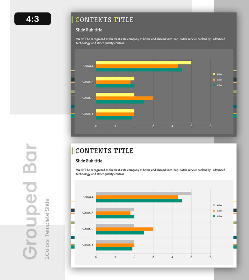
A horizontal grouped bar chart PowerPoint slide comparing four data series across multiple items. Yellow, orange, teal, and blue bars represent distinct values (Value 1 through Value 4) for clear numerical comparison. The dark gray background provides strong contrast with bright-colored bars, ensuring excellent data readability in presentations. This 2-slide set includes both dark and light background versions, adaptable to any business template. Ideal for financial reports, market analysis, performance reviews, and any presentation requiring multi-series data visualization.
Usage Points
-
Main Usage
Enables simultaneous comparison of multiple data points across categories, making it easy to identify trends, rankings, and magnitude differences. Four distinct color-coded series allow complex datasets to be presented clearly and intuitively.
-
How to Use
Input your quantitative data (sales figures, satisfaction scores, market share, KPIs) into each bar segment. Adjust bar lengths and update the legend to match your dataset. The dark background ensures clarity when projected in conference rooms or large venues.
-
Recommended For
Financial reports, quarterly earnings presentations, market research findings, departmental performance comparisons, sales analysis, and executive briefings. Suitable for finance professionals, analysts, marketers, and business leaders presenting data-driven insights.
-
Slide Structure
Four items (Value 1–4) with 3–4 data series represented as horizontal bars. X-axis scale ranges from 0 to 6 with gridlines. Includes color-coded legend. Two background variants (dark gray and white) provided for flexible integration into different presentation templates.
Related Products
-

Business Analysis Segmented Vertical Bar Graph – Optimized for Market and Competitor Analysis
#Market and Competitor Analysis #Graph #Competitor Analysis
-

Chart Analysis of Aerobic Exercise – Market Share Visualization
#Market and Competitor Analysis #Diagram #Graph
-

Market Trends Comparison Bar Graph – An Easy Way to Visualize Data
#Graph #Line #Line Chart
-

City Theme Market Share Graph – Business Data Visualization
#Product/Service Introduction #Market and Competitor Analysis #Graph
