Speech Concept: Donut Chart Analysis - Clear Data Visualization
RB0800008-1_8
- Last Update 03/19/2025
- File Size 1.7MB
- # of Slides 2
- File Format PPTX
- Slide Ratio 4:3
- Color
Keywords
About the Product
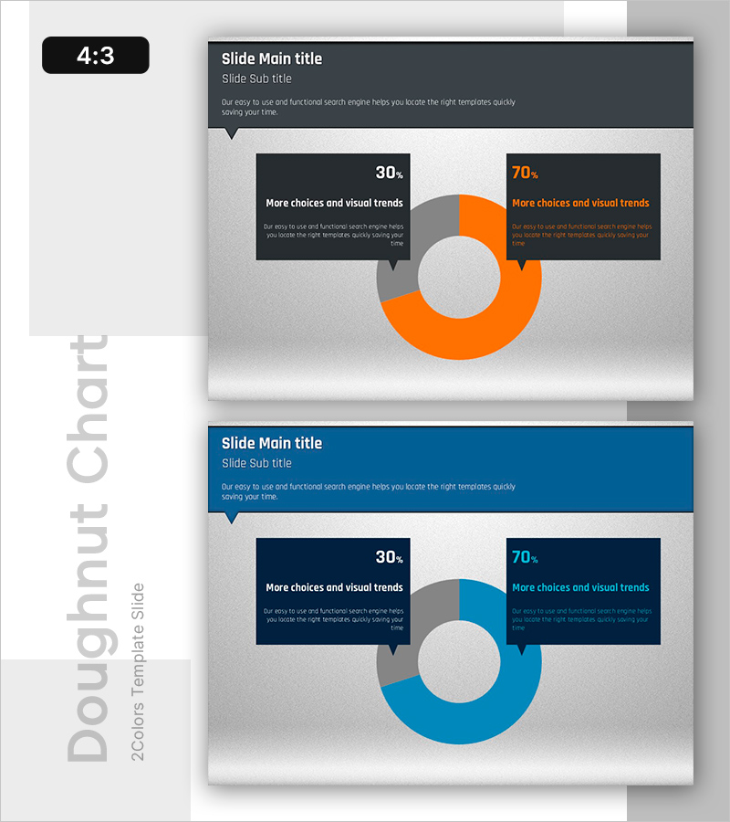
A PowerPoint slide featuring a two-segment donut chart that clearly visualizes data proportions in orange and blue tones. The 30%-70% ratio is displayed with accompanying speech bubble text boxes on both sides for analysis content. This 2-slide PPT set is ready to use for presenting company performance analysis, market share, customer satisfaction surveys, and other ratio-based data in business presentations.
Usage Points
-
Main Usage
A data visualization slide using donut charts to represent proportional information. The 30%-70% two-segment ratio is displayed as a centered circular graph, ideal for conveying market share, customer composition, performance metrics, and comparative data.
-
How to Use
Enter analysis content in the left 30% section and right 70% section respectively, and add the slide title in the header area. Insert a logo or key figure in the center circle to enhance emphasis and visual impact.
-
Recommended For
Recommended for executive reports, marketing analysis presentations, business performance briefings, customer satisfaction survey results, and market analysis presentations. Suitable for finance, retail, IT, and manufacturing professionals requiring data-driven decision-making.
-
Slide Structure
2-slide set. Each slide features a dark gray header (title and subtitle), a centered donut chart (70% segment in orange or blue + 30% segment in gray), and left-right speech bubble text boxes for analysis input. Formatted in 4:3 ratio PPTX.
Related Products
-

Audio Icons and Comparison Graphs – A New Dimension in Market Analysis
#Market and Competitor Analysis #Graph #Market Analysis
-

Trend of Market Share by Suit Product – Effective Graph for Market Analysis
#Market and Competitor Analysis #Graph #Market Analysis
-

Sensuous Cloud Presentation Template – Market Analysis and Financial Performance
#Market and Competitor Analysis #Financial Plans and Performance #Graph
-

Main Business Analysis Graph – Performance Insights
#Company Introduction #Business Introduction #Diagram
