Origami Pie Chart Slide – Effective Data Visualization
RB0800007_8
- Last Update 03/18/2025
- File Size 0.2MB
- # of Slides 2
- File Format PPTX
- Slide Ratio 4:3
- Color
Keywords
About the Product
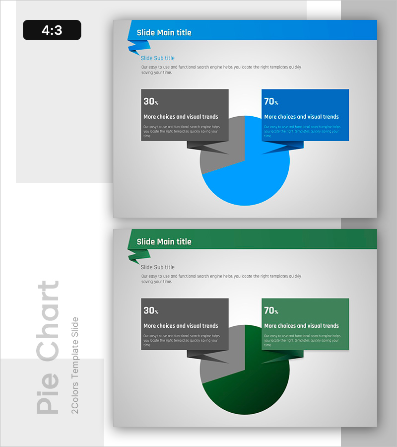
A professional pie chart PowerPoint slide that effectively visualizes the ratio of two data items. The design uses contrasting blue and gray colors to clearly represent 30% and 70% proportions, with text boxes positioned beside each section for detailed explanations. This 4:3 aspect ratio template includes 2 slides and is ideal for presenting market share, customer satisfaction, budget allocation, and comparative data analysis. The gradient effect on pie sections adds depth, making your presentation more engaging and data-driven.
Usage Points
-
Main Usage
This slide template is designed to compare and visualize the composition of two data categories at a glance. Use it to present market share, customer satisfaction metrics, budget distribution, or competitive analysis. The distinct blue and gray color scheme emphasizes the difference between the two segments, making data comparison immediately clear to your audience.
-
How to Use
Customize the text boxes next to each pie section with your item names and descriptions to match your presentation context. Insert this slide into business reports, marketing proposals, or investor pitch decks where numerical comparison is essential. All colors, percentages, and text are fully editable to align with your brand guidelines and data.
-
Recommended For
Ideal for marketing professionals, sales teams, executives, data analysts, and consultants who need to communicate data-driven insights. Perfect for presentations covering market analysis, competitive positioning, customer segmentation, budget status, and performance metrics. Suitable for business reports, proposals, and strategic planning documents.
-
Slide Structure
The template consists of 2 slides, each featuring a header bar (blue or green background), subtitle, a 2-section pie chart (30% and 70% ratio), and left-right text boxes. The pie sections include gradient effects for visual depth, with connector arrows linking each section to its corresponding text box. Formatted in 4:3 aspect ratio PPTX.
Related Products
-

User Analysis Graph by Age Group – Advanced Data Insights
#Market and Competitor Analysis #Diagram #Graph
-

Travel App Business Future Outlook Visual Slide with Step-by-Step Schedule
#Business Strategy #Market and Competitor Analysis #Diagram
-

Key Performance Analysis Bar Graph – Visualization of KPIs
#Company Introduction #Market and Competitor Analysis #Graph
-

Visualizing Market Analysis with Yearly Round Bar Graph
#Market and Competitor Analysis #Graph #Market Analysis
