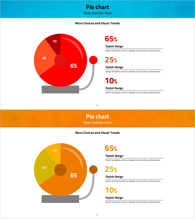
Alarm Bell Illustration Pie Chart - Emphasizing Visual Trends
RJ0600044_5
- Last Update 08/28/2025
- File Size 6.9MB
- # of Slides 2
- File Format PPTX
- Slide Ratio 16:9
- Color
Keywords
About the Product
A pie chart PowerPoint slide that visualizes three data segments (65%, 25%, 10%) using red and orange gradient colors. This presentation template features an alarm bell illustration and gray connector lines to highlight each data category. The 2-slide deck in 16:9 widescreen PPTX format is fully editable and ready to use for market share analysis, customer satisfaction surveys, sales composition, budget allocation, and survey response rates. The visual design emphasizes data trends and captures audience attention during business presentations and analytical reports.
Usage Points
-
Main Usage
Visualizes three data segments in a circular chart format for instant comprehension. Ideal for presenting market share, customer satisfaction distribution, sales composition, budget allocation, and survey results. The color-coded segments and percentage labels make data comparison intuitive and engaging for audiences.
-
How to Use
Replace the 65%, 25%, 10% values and labels with your own data. The red and orange color scheme can be retained or customized to match your corporate brand colors. The alarm bell icon and connector lines are optional design elements that can be modified or removed as needed.
-
Recommended For
Marketing analysts, financial professionals, business executives, data analysts, and project managers presenting ratio-based data. Suitable for market analysis reports, financial statements, business performance presentations, market research findings, customer satisfaction surveys, budget breakdowns, and sales performance reviews.
-
Slide Structure
Two-slide deck featuring a red-toned pie chart on the first slide (emphasizing the 65% primary segment) and an orange-toned pie chart on the second slide (same 3-segment structure). Each slide includes an alarm bell illustration and gray connector lines pointing to data labels, with a text description area positioned on the right side.
Related Products
-

Red Green Detail Analysis Chart – Visualizing Market Share
#Market and Competitor Analysis #Graph #Market Status
-

Red Green Mockup Chart - Visualizing Investment Returns
#Financial Plans and Performance #Graph #Other
-

Pie Charts and Mini Illustrations – Visual Data Analysis Tool
#Technical Approach #Graph #Research and Development
-

Camera Pie Chart – Market Share Analysis
#Market and Competitor Analysis #Graph #Other
