Utilization Share of Natural Energy Sources - Visualizing Market Status with Pie Charts
RB0500013_4
- Last Update 03/13/2025
- File Size 5.5MB
- # of Slides 2
- File Format PPTX
- Slide Ratio 4:3
- Color
Keywords
- #Content-Based Slides
- #Design-Based Slides
- #Market and Competitor Analysis
- #Graph
- #Market Status
- #Market Share
- #Circles
- #Pie Chart
- #4:3
- #pie chart PowerPoint slide
- #circular graph presentation template
- #market share analysis PPT
- #energy market visualization
- #percentage distribution chart
- #multi-pie chart slide design
About the Product
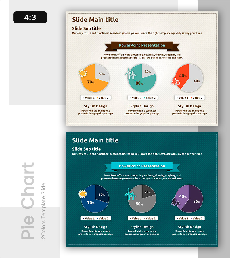
A PowerPoint slide featuring three pie charts that visualize natural energy utilization rates and market status. The charts use a vibrant color palette of orange, teal, and coral to clearly represent the market share of different energy sources, with percentage values and legends positioned for optimal readability. This 2-slide presentation template is ready to use for market analysis reports, business status updates, energy policy presentations, and stakeholder briefings. Each chart includes a text area below for adding detailed insights or analytical commentary, making it fully customizable for your specific data.
Usage Points
-
Main Usage
Designed to compare quantitative data such as natural energy utilization rates, market share distribution, and energy source composition at a glance. The three pie charts arranged horizontally enable simultaneous visualization of ratio changes across different time periods, regions, or scenarios, with dedicated text areas below each chart for analytical commentary.
-
How to Use
Ideal for business status reports (market analysis section), energy policy presentations, environmental seminars, investor briefings, and academic conferences. Double-click any pie chart to edit colors, percentages, and legends directly in PowerPoint, allowing quick customization to match your actual data without design skills required.
-
Recommended For
Energy and environmental sector planners, market research analysts, policy makers, investor relations professionals, and academic presenters who need to communicate quantitative ratio data persuasively. Particularly effective when comparing composition percentages across multiple categories simultaneously.
-
Slide Structure
Slide 1: Three pie charts arranged horizontally, each with two data segments, legend, and editable text area below. Slide 2: Same layout with teal-toned background for visual contrast and emphasis. 4:3 aspect ratio, PPTX format with all elements fully editable and resizable.
Related Products
-

Pie Chart for Workout Type Preferences – Market Status
#Market and Competitor Analysis #Diagram #Graph
-

Travel Survey Results – Market Share Visualization
#Market and Competitor Analysis #Graph #Market Status
-

Pie Chart Analysis for International Trade – Market Share Visualization
#Market and Competitor Analysis #Graph #Market Status
-

Triangle Pattern PPT Template for Visualizing Market Share with Pie Charts
#Market and Competitor Analysis #Graph #Market Status
