Grouped Bar Chart for Learning Categories
RB0300016-1_4
- Last Update 03/10/2025
- File Size 5MB
- # of Slides 2
- File Format PPTX
- Slide Ratio 4:3
- Color
Keywords
About the Product
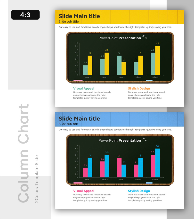
A grouped vertical bar chart PowerPoint slide designed for comparing learning categories, market analysis, and competitive data. This presentation template displays 5 items with 2 data series (teal and yellow) positioned side by side, allowing viewers to instantly compare both item-to-item differences and series-to-series trends. The dark chalkboard-style frame emphasizes the data visualization, with clear numerical labels displayed above each bar. Two slide variations are included: the first features teal and yellow bars, while the second offers teal and pink bars, giving you flexibility to match your presentation's color scheme. This chart template is ready to use in educational materials, business reports, and marketing presentations.
Usage Points
-
Main Usage
This chart is optimized for comparing multiple items across two data series. It effectively visualizes learning performance by category, market share comparisons, product specification benchmarks, quarterly sales comparisons, and other quantitative datasets that require side-by-side analysis.
-
How to Use
The slide features a chalkboard-style dark background frame containing 5 items and 2 grouped bars per item. Double-click the numerical labels above each bar to replace them with your actual data. Choose between the provided color schemes: teal and yellow, or teal and pink, depending on your presentation theme.
-
Recommended For
Ideal for educational institutions presenting learning outcome analysis, corporate quarterly performance reports, marketing teams conducting market research presentations, product development teams analyzing competitor data, and consulting firms delivering benchmarking reports.
-
Slide Structure
2-slide set. Each slide displays a grouped vertical bar chart with 5 items (Value 1–5) on the X-axis and a 0–5 numerical range on the Y-axis. The first slide uses teal and yellow bars, while the second uses teal and pink bars. All bars include precise numerical labels for clear data communication.
Related Products
-

Big Data Analysis Graph - An Effective Market Analysis Tool
#Market and Competitor Analysis #Graph #Competitor Analysis
-

Clustered Vertical Bar Comparison Analysis Chart – Visualization for Competitiveness
#Market and Competitor Analysis #Diagram #Graph
-

Competitor Capability Analysis Chart – Efficient Market Analysis
#Market and Competitor Analysis #Graph #Competitor Analysis
-

Smart Analytics Insight – Market and Competitive Analysis Presentation
#Market and Competitor Analysis #Graph #Text Box
