Comparative Analysis Pie Chart – Visualizing Service Performance
RB0200006_6
- Last Update 03/08/2025
- File Size 0.4MB
- # of Slides 2
- File Format PPTX
- Slide Ratio 4:3
- Color
Keywords
- #Content-Based Slides
- #Design-Based Slides
- #Product/Service Introduction
- #Market and Competitor Analysis
- #Graph
- #Development Status
- #Competitor Analysis
- #Circles
- #Pie Chart
- #4:3
- #pie chart PowerPoint slide
- #comparative analysis presentation
- #circular chart template
- #data visualization slide
- #performance analysis PPT
About the Product
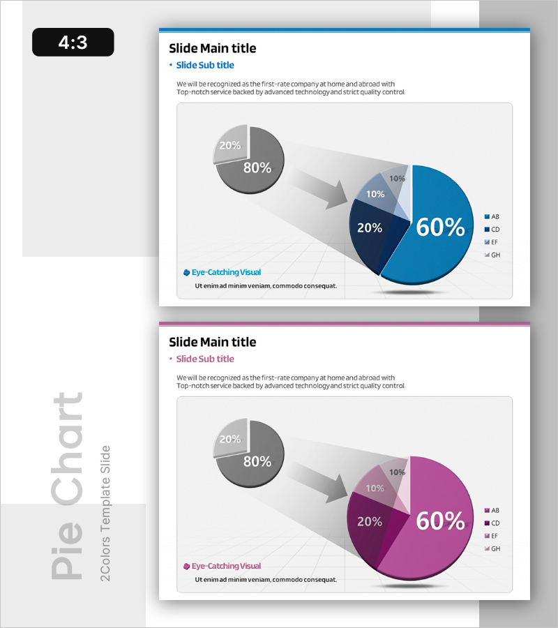
A professional pie chart PowerPoint slide designed to compare service performance and market share at a glance. The design features a small pie chart expanding into a larger pie chart via directional arrows, intuitively showing data progression and comparative analysis. Available in two color schemes—blue and magenta—each slide displays proportional data for four segments in 4:3 aspect ratio. Ready-to-use presentation template for reports, analytical materials, and performance presentations.
Usage Points
-
Main Usage
Visualize proportional data such as service performance, market share, customer composition, and revenue distribution using pie charts. The expanding arrow design from small to large chart clearly communicates data changes and comparative insights to audiences.
-
How to Use
Apply to market analysis and performance analysis sections in reports, quarterly or annual performance presentations, customer segmentation analysis, and business achievement slideshows. Edit the legend and numerical values with your own data for immediate use.
-
Recommended For
Marketing managers, sales directors, executives preparing reports, management consultants, data analysts, and business performance presenters who need to effectively communicate ratio-based data to stakeholders.
-
Slide Structure
Slide 1: Blue-toned pie chart—small circle (20%/80% two-segment) + directional arrow + large circle (60%/20%/10%/10% four-segment) layout. Slide 2: Magenta-toned identical structure. Each slide includes legend, title, and descriptive text areas.
Related Products
-

3D Circle Graph for Competitor Analysis – Insight into Market Dynamics
#Product/Service Introduction #Market and Competitor Analysis #Graph
-

Online Presentation Template - Pie Chart & Radar Chart
#Product/Service Introduction #Market and Competitor Analysis #Graph
-

Competitor Comparison Analysis Graph
#Market and Competitor Analysis #Graph #Competitor Analysis
-

Blue Yellow Pie Chart – Market and Competitor Analysis
#Market and Competitor Analysis #Graph #Competitor Analysis
