Enrollment Stats & Ratios Donut Chart
RM0900013_7
- Last Update 03/04/2025
- File Size 0.3MB
- # of Slides 2
- File Format PPTX
- Slide Ratio 16:9
- Color
Keywords
About the Product
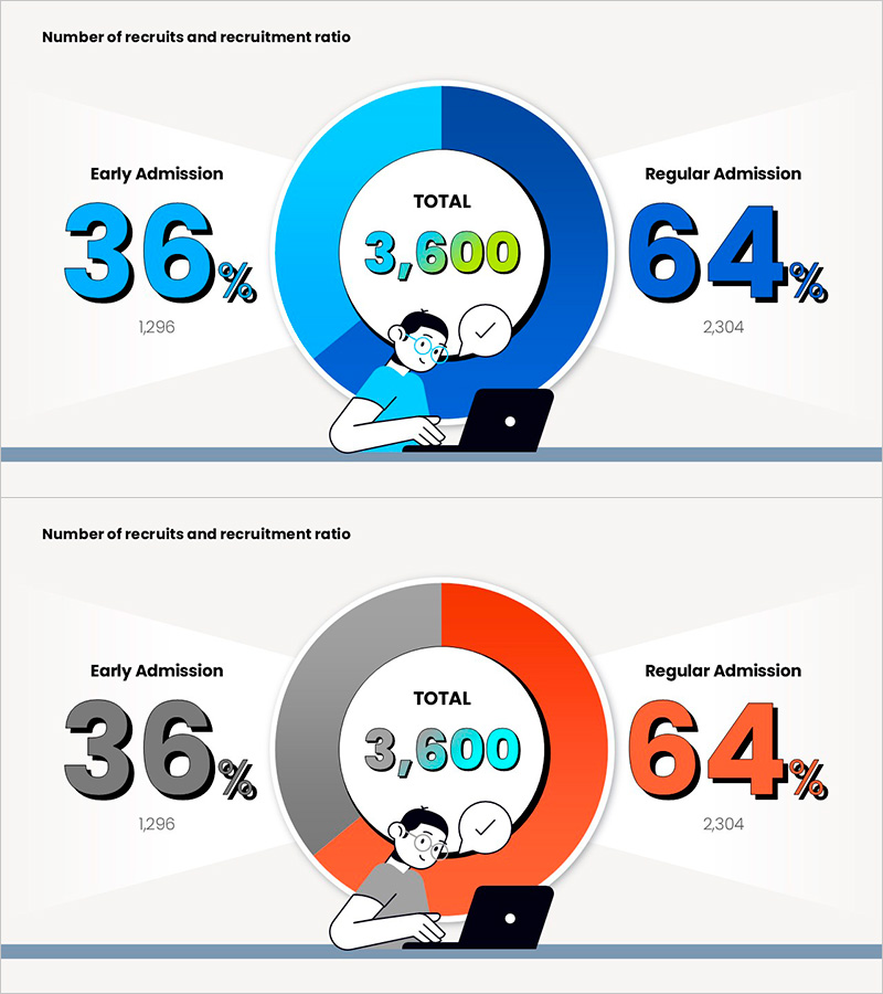
A PowerPoint slide featuring a two-segment donut chart that clearly compares student enrollment and recruitment statistics. The chart displays Regular Admission (64%) and Early Admission (36%) ratios in two distinct data series, with the total enrollment count (3,600) prominently centered. The design uses a navy and light blue color palette to differentiate data segments, complemented by an illustration character and checkmark icon for a friendly presentation tone. Provided as a 2-slide set in 16:9 widescreen format, the chart simultaneously displays both percentages and absolute numbers for comprehensive quantitative communication. Ideal for educational institutions, recruitment teams, and marketing departments presenting enrollment performance and admission statistics.
Usage Points
-
Main Usage
Visually communicates student enrollment statistics and admission pathway ratios for educational institutions. The chart clearly distinguishes between regular and early admission composition while the centered total enrollment figure conveys overall scale, making it suitable for decision-making presentations and institutional reports.
-
How to Use
Place this slide in the 'Enrollment Statistics' or 'Admission Overview' section of your presentation to intuitively explain recruitment composition to your audience. The combined display of percentages and absolute numbers makes it ideal for data-driven reports and enrollment information sessions. You can easily edit the colors and values to represent different ratio datasets.
-
Recommended For
University and graduate school admissions officers, education marketing teams, institutional research analysts, enrollment presentation coordinators, education ministry officials, and educational consulting firms preparing enrollment analysis and admission reports.
-
Slide Structure
Two-slide set featuring navy and light blue two-tone donut chart (2 segments) on the first slide and gray and orange two-tone donut chart (2 segments) on the second. Each slide displays percentages and absolute values on the left, category labels (Regular Admission/Early Admission) on the right, and total enrollment figures prominently in the center.
Related Products
-

Pie Chart for Decimal Ratio Analysis – Market Share Status
#Market and Competitor Analysis #Graph #Market Status
-

Visualizing Fish Market Share with Doughnut Chart – Vitality of the Ocean
#Market and Competitor Analysis #Graph #Market Status
-

Guide to Admission Evaluation Criteria with Donut Chart
#Market and Competitor Analysis #Graph #Market Status
-

How to Protect Your Environment Pie Chart
#Market and Competitor Analysis #Graph #Market Status
