Market Trend Analysis Mixed Chart – Capturing Data and Insights
RM0400008_6
- Last Update 02/17/2025
- File Size 0.3MB
- # of Slides 2
- File Format PPTX
- Slide Ratio 16:9
- Color
Keywords
About the Product
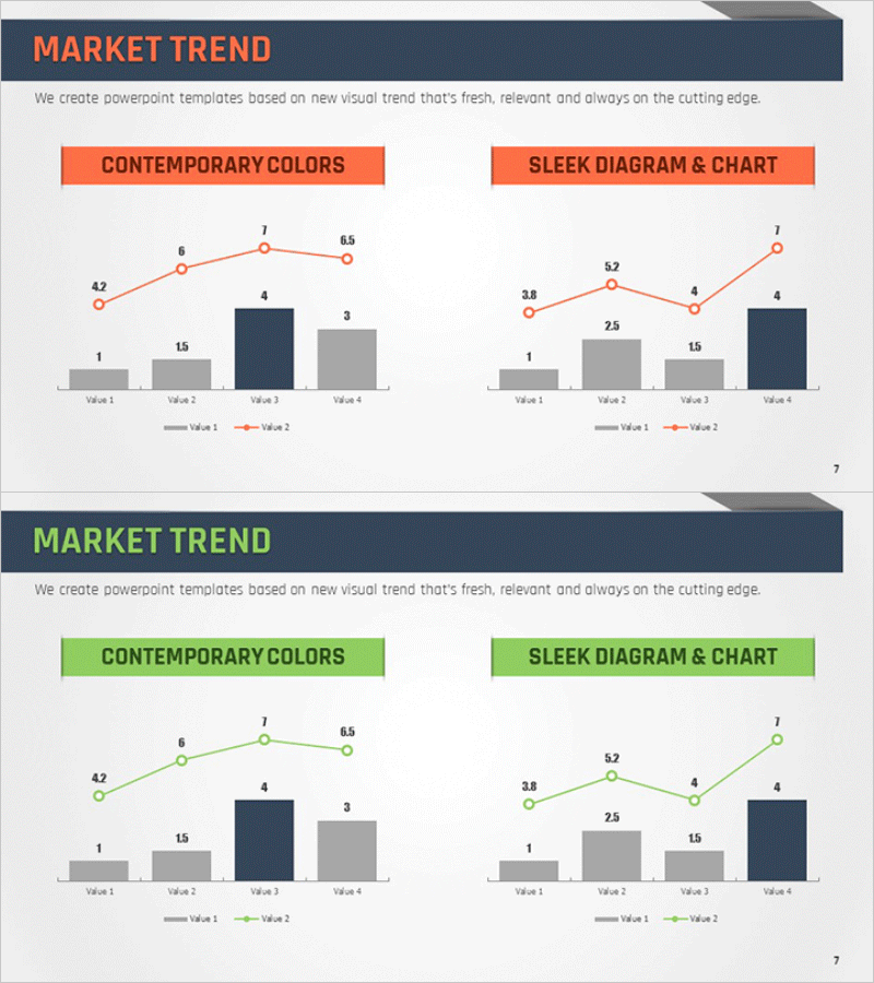
A mixed chart PowerPoint slide essential for market trend analysis. This slide combines line graphs and bar charts to visualize both trends and absolute values simultaneously. The dual-tone color scheme of orange and navy blue clearly distinguishes data layers, enabling comparison across four data segments. Perfect for presenting competitive analysis, market share trends, revenue progression, and other business metrics. Delivered in 16:9 widescreen PPTX format with fully editable elements—customize colors, values, and labels to match your presentation needs.
Usage Points
-
Main Usage
This mixed chart slide displays both market trend trajectories and specific data points in a single visualization. The line graph illustrates change over time, while bar charts emphasize concrete values at each interval. Ideal for executive presentations, investor pitches, and partner briefings where data-driven market insights must be communicated with credibility and clarity.
-
How to Use
The slide layout features 'Contemporary Colors' on the left and 'Sleek Diagram & Chart' on the right. Double-click any value or label to replace it with your actual data. Adjust line color (orange) and bar colors (navy, gray) to align with your corporate branding. All chart elements remain fully editable within PowerPoint.
-
Recommended For
Ideal for market analysis sections in marketing plans, business reports, and investment pitch decks. Use when presenting market share evolution, competitive performance comparisons, revenue or customer growth trends, and industry growth rates. Suitable for CFOs, marketing managers, and business development teams supporting data-driven decision-making across all organizational levels.
-
Slide Structure
Two-slide set, each containing one title area and one mixed chart. Each chart displays four data points (Value 1–4) with two line series and four bar segments. Text input areas include one title field and two legend descriptions, totaling three editable text zones. The structure supports comparative data analysis across multiple metrics.
Related Products
-

Growth Comparison Mixed Chart – Market Trend Analysis
#Market and Competitor Analysis #Graph #Other
-

Elderly Silhouette Area Diagram – Market Trend Analysis
#Market and Competitor Analysis #Graph #Other
-

Market Trend Analysis Mixed Graph & Table
#Market and Competitor Analysis #Diagram #Graph
-

Competitor Analysis Broken Line Graph – Visualizing Market Trends
#Market and Competitor Analysis #Graph #Other
