Effectiveness Analysis Connector Diagram and Subdivided Column Graph
RM0400006_32
- Last Update 02/16/2025
- File Size 0.9MB
- # of Slides 2
- File Format PPTX
- Slide Ratio 16:9
- Color
Keywords
- #Content-Based Slides
- #Design-Based Slides
- #Business Management
- #Operational Plan
- #Diagram
- #Implementation Schedule
- #Project Implementation Schedule
- #Cluster
- #Chain Diagram
- #16:9
- #connector diagram PowerPoint
- #effectiveness analysis presentation
- #4-stage arrow slide
- #process flow PPT
- #subdivided column chart
- #business management slides
About the Product
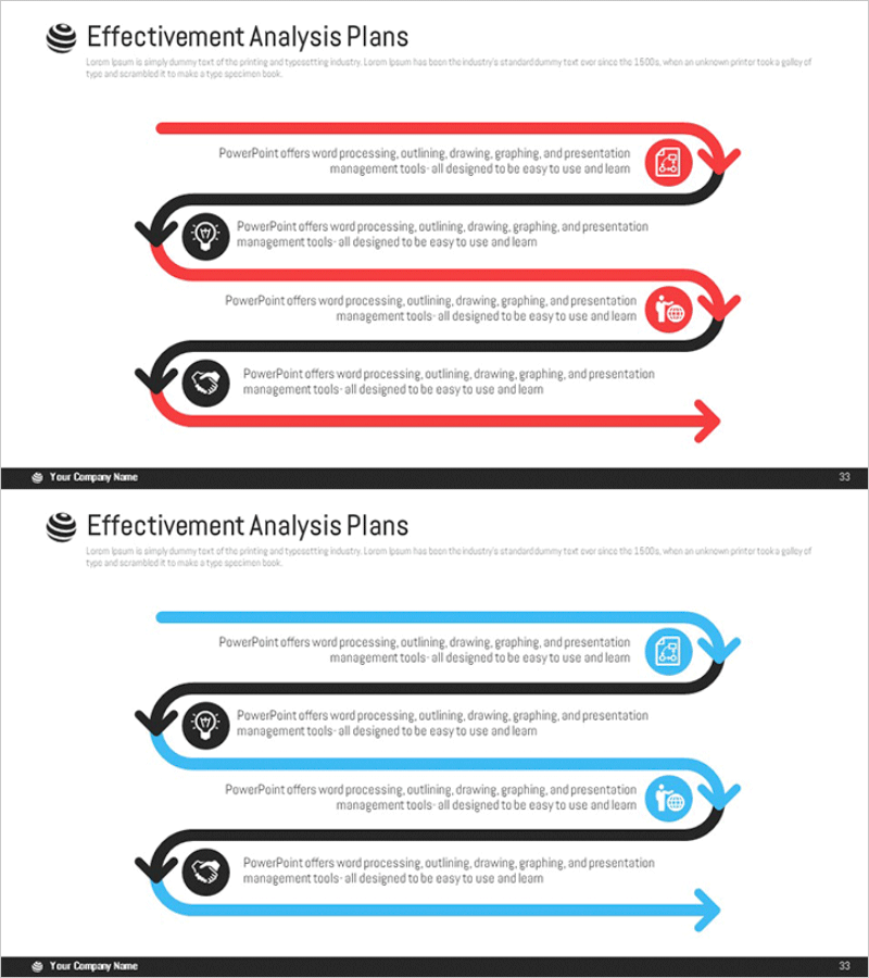
A PowerPoint slide featuring a 4-stage connector diagram and subdivided column graph for business effectiveness analysis. The design uses red and blue dual-tone arrow flows to clearly express sequential processes, with icons and text areas positioned at each stage for easy data entry. The subdivided column graph enables intuitive comparison of numerical data and is ready for immediate use in presentations, business reports, and operational planning documents. Delivered in 16:9 widescreen format with 2 slides in PPTX format.
Usage Points
-
Main Usage
Optimized for visualizing business effectiveness analysis and process stages. The 4-stage connector diagram represents sequential processes such as planning→execution→evaluation→improvement, while the subdivided column graph enables comparative analysis of performance metrics at each stage.
-
How to Use
Enter process names, responsible parties, and timelines in each stage's text area, and modify the column graph data values to reflect actual performance figures. The red and blue colors can be used to distinguish stage importance or departmental divisions, and icons can be customized to represent each stage's characteristics.
-
Recommended For
Ideal for business managers, operations officers, and project leaders presenting monthly, quarterly, or annual performance analysis. Also effective for consulting reports, executive briefings, strategy meetings, and educational or seminar materials.
-
Slide Structure
Slide 1: 4-stage connector diagram (left black circular icons + right red/blue arrow flow + text boxes). Slide 2: Same structure in blue tone + subdivided column graph at bottom (5-item comparison). 16:9 widescreen format, fully editable PPTX.
Related Products
-

Linear Diagram Slide for Future Food Service Project Promotion Plan
#Business Management #Operational Plan #Diagram
-

Schedule Management Diagram - Blue Pink Theme
#Business Management #Operational Plan #Diagram
-

Marketing Effectiveness Analysis Diagram – A Visual Overview for Effective Business Execution!
#Business Management #Operational Plan #Diagram
-

Marketing Effectiveness Analysis Slide – Cluster Diagram for Operational Planning
#Business Management #Operational Plan #Diagram
