Market Trend Analysis Radial Graph – Connecting Data Visually
RM0400003_6
- Last Update 02/15/2025
- File Size 3.6MB
- # of Slides 2
- File Format PPTX
- Slide Ratio 16:9
- Color
Keywords
About the Product
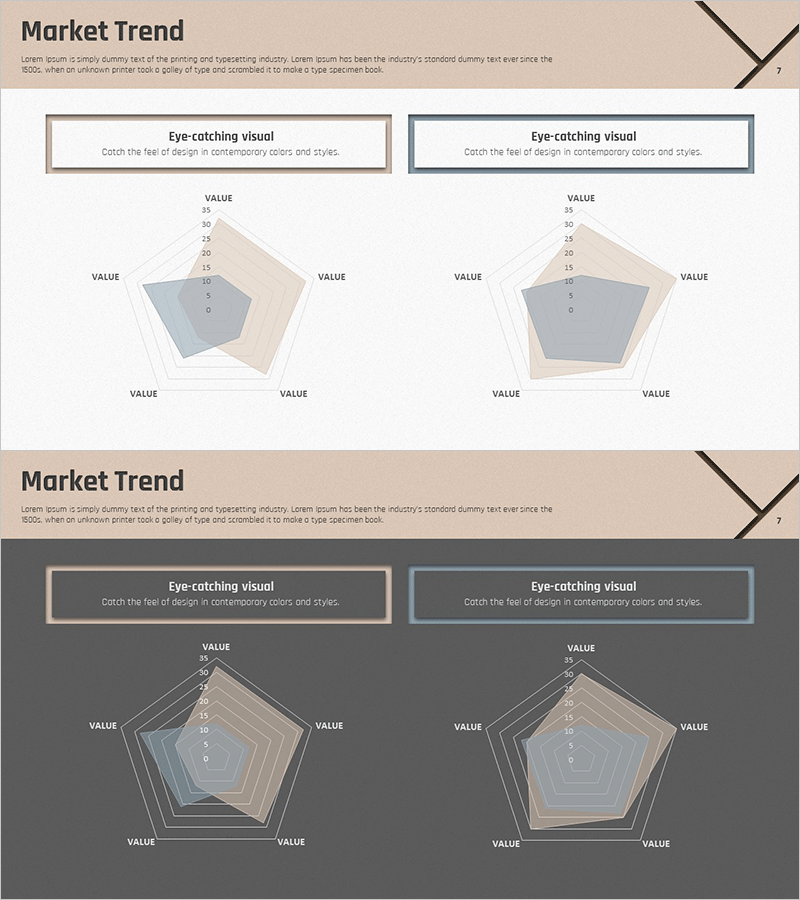
A 5-axis radial chart PowerPoint slide designed for market trend analysis and multi-dimensional data comparison. The slide features a radial diagram with five axes extending from a central point, displayed on both light beige and dark gray backgrounds for flexible presentation environments. Each axis is labeled with VALUE fields, allowing you to input diverse business metrics such as sales volume, market share, customer satisfaction, brand awareness, and competitive strength. The two-slide set provides versatility for different presentation contexts. This radial chart template enables intuitive visualization of complex datasets in professional business presentations.
Usage Points
-
Main Usage
Visualizes multiple quantitative indicators radiating from a central point for comparative analysis. Ideal for market trend assessment, competitive positioning, organizational capability evaluation, and product feature comparison when presenting five or more data dimensions simultaneously.
-
How to Use
Enter metric names in the VALUE labels on each axis, then plot numerical values along the lines extending from the center outward. Use the light background version for daytime presentations and print materials, and the dark background for evening presentations and digital displays. Apply color fills to highlight specific data regions.
-
Recommended For
Recommended for executive reports, strategy meetings, marketing analysis presentations, consulting proposals, and business plan documents. Ideal for data analysts, marketing professionals, business planning teams, and consultants explaining complex multi-factor metrics.
-
Slide Structure
Two-slide set featuring identical 5-axis radial charts on contrasting backgrounds—light beige and dark gray. Each slide includes a title area at the top, a centrally positioned radial diagram with five evenly distributed axes, and VALUE labels positioned around the chart perimeter for data input.
Related Products
-

Customer Analysis Diagram & Segmentation Graph – In-depth Market Insights
#Market and Competitor Analysis #Graph #Customer Analysis
-

Manufacturing Donut Circle Chart – Visual Data Representation
#Product/Service Introduction #Business Introduction #Graph
-

Analysis of Aerobic and Muscular Exercise – Market Share Visualization
#Market and Competitor Analysis #Graph #Market Share
-

Table Chart & Clustered Column Graph – Market and Competitor Analysis
#Market and Competitor Analysis #Diagram #Graph
