Positive Performance Analysis Chart
RM0300010_17
- Last Update 02/09/2025
- File Size 1.1MB
- # of Slides 2
- File Format PPTX
- Slide Ratio 16:9
- Color
Keywords
- #Content-Based Slides
- #Design-Based Slides
- #Company Introduction
- #Market and Competitor Analysis
- #Graph
- #Key Achievements
- #Future Outlook
- #Horizontal Bar
- #Line
- #Horizontal Bar Chart
- #Line Chart
- #16:9
- #line chart PowerPoint
- #dual-series chart template
- #performance analysis slide
- #trend comparison graph
- #how to create line chart in PowerPoint
About the Product
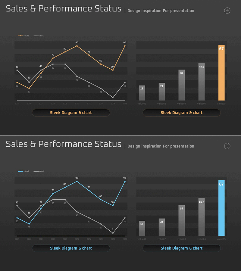
A dual-series line chart PowerPoint slide designed to compare sales and performance trends simultaneously. The dark background features orange and blue trend lines that clearly visualize data changes over time. The accompanying horizontal bar chart compares final performance by category, with the last item highlighted in orange to emphasize key metrics. Composed of 2 slides in 16:9 aspect ratio, delivered in fully editable PPTX format for immediate customization.
Usage Points
-
Main Usage
Analyze and report quarterly or monthly sales trends and performance metrics side by side. The dual-series line chart compares two performance indicators, while the bar graph ranks final results by category to support decision-making.
-
How to Use
Use in sales reports, quarterly performance presentations, and business review meetings to explain performance trends and goal achievement rates. Simply replace the data points and values with your actual figures for immediate deployment.
-
Recommended For
Sales teams, marketing departments, executives, business analysts, and consultants presenting regular performance analysis and trend reports. Ideal when comparing two or more performance metrics simultaneously.
-
Slide Structure
Slide 1: Title with dual-series line chart (2 series, approximately 10 data points) and horizontal bar chart (5 categories, last item highlighted). Slide 2: Identical layout with alternate color scheme (blue highlight instead of orange). All chart elements are editable individual shapes.
Related Products
-

Market Trends and Competitor Analysis Chart – Emphasizing Future Outlook
#Market and Competitor Analysis #Graph #Future Outlook
-

Performance Advantage Analysis Chart – Evolving Business Success
#Company Introduction #Market and Competitor Analysis #Diagram
-

Key Performance Bar & Line Analysis Chart – Integrated Market Performance Visualization
#Company Introduction #Market and Competitor Analysis #Graph
-

Simple Car Wide Presentation Line Chart – Market and Competitive Analysis
#Market and Competitor Analysis #Financial Plans and Performance #Graph
