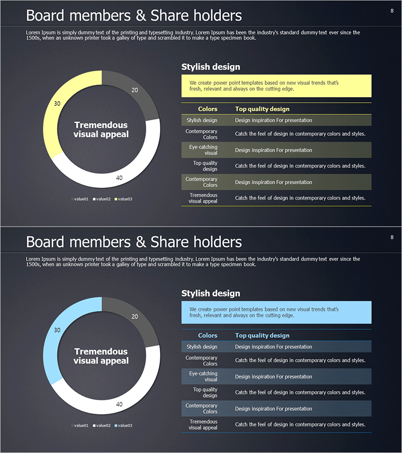
Shareholder Status Distribution Analysis Chart – Visualizing Shareholder Information
RM0300008_7
- Last Update 02/09/2025
- File Size 8.1MB
- # of Slides 2
- File Format PPTX
- Slide Ratio 16:9
- Color
Keywords
- #Content-Based Slides
- #Design-Based Slides
- #Company Introduction
- #Market and Competitor Analysis
- #Diagram
- #Graph
- #Shareholder Structure
- #Market Analysis
- #Table
- #Circles
- #Standard Table
- #Doughnut Chart
- #16:9
- #donut chart PowerPoint slide
- #pie chart presentation template
- #shareholder distribution visualization
- #equity structure diagram
- #how to create donut chart in PowerPoint
About the Product
A professional donut chart PowerPoint slide designed to visualize shareholder composition and equity distribution. This 2-slide set presents shareholding ratios with clarity and visual impact. The dark background contrasts with three color-coded segments—yellow, light blue, and white—making each shareholder group's stake immediately recognizable. The center area accommodates key messaging, while the right-side information table provides detailed numerical data. Ideal for investor reports, shareholder meetings, and executive presentations where capital structure and ownership breakdown require clear visual communication.
Usage Points
-
Main Usage
Communicate shareholding patterns, capital structure, and ownership composition through a visually distinct donut chart format. The dual-layer design—central messaging area plus supporting data table—ensures both high-level understanding and detailed accuracy for stakeholders.
-
How to Use
Deploy in investor relations presentations, shareholder meeting materials, financial reports, and corporate overview decks. Customize segment colors and numerical values to match your actual shareholding data. The template structure supports quick adaptation for different equity scenarios.
-
Recommended For
CFOs, financial officers, investor relations managers, executives, and corporate communications teams presenting capital structure. Suitable for public company disclosures, fund management reports, M&A presentations, and institutional investor briefings.
-
Slide Structure
Two-slide template with dark background. Each slide features a centered donut chart with 3–4 color-differentiated segments. The hollow center provides space for headline text or key metrics. A right-aligned information table displays legend details and supporting data points aligned with chart segments.
Related Products
-

Visualizing Board Members and Shareholders with a Sleek Diagram
#Company Introduction #Market and Competitor Analysis #Diagram
-

Shareholder Status Analysis with Pie Charts and Graphs
#Company Introduction #Market and Competitor Analysis #Diagram
-

Shareholder Status Analysis Chart & Description – Sleek Diagram
#Company Introduction #Market and Competitor Analysis #Diagram
-

Status Analysis Donut Chart – Visualizing Market and Shareholder Status
#Company Introduction #Market and Competitor Analysis #Diagram
