Main Business Analysis Graph – Performance Insights
RM0200013_6
- Last Update 02/05/2025
- File Size 2.5MB
- # of Slides 2
- File Format PPTX
- Slide Ratio 16:9
- Color
Keywords
- #Content-Based Slides
- #Design-Based Slides
- #Company Introduction
- #Business Introduction
- #Diagram
- #Graph
- #Key Achievements
- #Business Areas
- #Cluster
- #Horizontal Bar
- #Closed Cluster Diagram
- #Horizontal Bar Chart
- #16:9
- #horizontal bar chart PowerPoint
- #performance comparison slide
- #business analysis PowerPoint template
- #data visualization slides
- #how to create bar chart in PowerPoint
About the Product
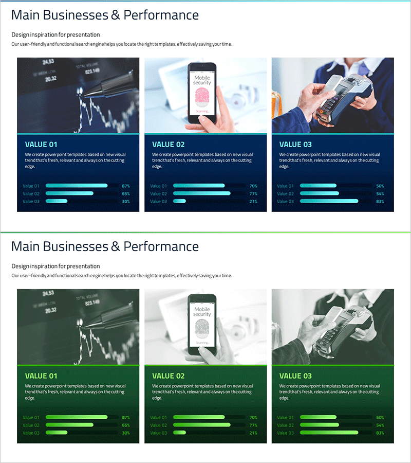
A professional horizontal bar chart PowerPoint slide for comparing business performance and key metrics at a glance. Features a dark blue background with cyan-colored bars visualizing three data items, each displaying percentage values. The 2-slide set includes a primary performance comparison layout and an alternative data structure for flexible reuse. Ideal for quarterly business reports, performance presentations, and data-driven analysis decks. All text, values, and bar lengths are fully editable to match your specific metrics and branding.
Usage Points
-
Main Usage
Visualize comparative metrics such as quarterly sales, departmental performance, product revenue, or customer satisfaction scores across three categories using horizontal bars. Percentage labels provide clear relative comparison, while the dark blue professional tone suits executive briefings and investor presentations.
-
How to Use
Insert into quarterly performance reports, business plan decks, marketing analysis presentations, and investment pitch materials. Double-click item names and values to edit; bar lengths auto-adjust proportionally. Customize colors by selecting bar elements and using PowerPoint's shape fill options.
-
Recommended For
CFOs presenting quarterly results, marketing managers analyzing channel performance, business development teams benchmarking portfolios, and consultants creating comparative analysis. Recommended for board meetings, shareholder reports, client proposals, and any presentation requiring data credibility.
-
Slide Structure
2-slide set with identical 3-item horizontal bar chart layouts. Each slide displays VALUE 01, VALUE 02, and VALUE 03 with varying bar lengths (87%, 65%, 30% examples) to emphasize comparison. Dark blue background, cyan gradient bars, white text labels, and percentage indicators throughout.
Related Products
-

Company Overview and Performance Graph Slide Template – Performance Highlight
#Company Introduction #Diagram #Graph
-

Medical Field Illustration Closure Diagram – Enhancing Visual Understanding
#Product/Service Introduction #Business Introduction #Diagram
-

Key Achievements and Service Benefits Infographic Slide – Red and Blue
#Company Introduction #Product/Service Introduction #Diagram
-

Furniture Business Area Diagram – Strategic Vision and Growth
#Business Introduction #Business Vision and Strategy #Diagram
