Core Services Connection Diagram – Visualizing System and Service Compositions
RM0200005_23
- Last Update 02/02/2025
- File Size 0.3MB
- # of Slides 2
- File Format PPTX
- Slide Ratio 16:9
- Color
Keywords
- #Content-Based Slides
- #Design-Based Slides
- #Technical Approach
- #Diagram
- #Service Architecture Diagram
- #System Architecture Diagram
- #Cluster
- #Chain Diagram
- #16:9
- #circular diagram PowerPoint
- #connection diagram slide template
- #service architecture diagram
- #system composition slide
- #5-node cycle diagram
- #how to create connection diagram in PowerPoint
About the Product
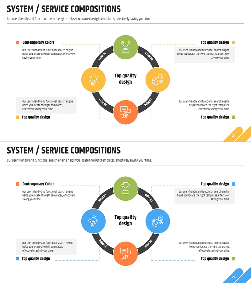
A PowerPoint slide that visualizes system and service compositions through a 5-node circular connection structure. The central core concept is surrounded by four elements connected via arrows, creating an intuitive representation of service relationships and system architecture. Each node is distinguished by four distinct colors—orange, yellow, green, and blue—to enhance information clarity and visual hierarchy. This slide template is ideal for business presentations, service ecosystem explanations, organizational structure descriptions, and system architecture overviews where interconnected relationships need clear visual communication.
Usage Points
-
Main Usage
Visually represents the interconnected relationships between core services or system components within an organization. The center-focused circular structure demonstrates that each element holds equal importance and interacts with others, making it highly effective for business presentations explaining service ecosystems, digital platforms, or system architectures.
-
How to Use
Replace the central 'Top quality design' text with your organization's primary service or system name. Update the four surrounding nodes with related services, components, or functional areas. Customize icons and labels to match your organizational context, then integrate into business proposals, organizational presentations, or system architecture briefings.
-
Recommended For
Recommended for executives, planning teams, marketing departments, and IT teams presenting service structures or system compositions. Particularly effective for new business proposals, organizational restructuring explanations, digital ecosystem introductions, integrated system architecture presentations, and cross-functional service relationship demonstrations.
-
Slide Structure
One central node (orange) surrounded by four connected nodes (yellow, green, blue, green) arranged in cardinal positions. Each node includes an icon and text label. Black bidirectional arrows connect the central node to all surrounding nodes, representing mutual relationships. Optimized for 16:9 widescreen format with 2-slide composition.
Related Products
-

Linked Process Execution Diagram – Cluster and Service Composition
#Technical Approach #Diagram #Service Architecture Diagram
-

Core Values Linked to the Central System
#Technical Approach #Diagram #Service Architecture Diagram
-

Innovative Diagram for Food Ingredient Composition
#Technical Approach #Diagram #Service Architecture Diagram
-

Chromosome Theme Wide PowerPoint Template – Stylish Diagram Composition
#Technical Approach #Diagram #Service Architecture Diagram
