Competitor Breakdown Analysis Graph
RM0100008_10
- Last Update 01/26/2025
- File Size 1.1MB
- # of Slides 2
- File Format PPTX
- Slide Ratio 16:9
- Color
Keywords
- #Content-Based Slides
- #Design-Based Slides
- #Market and Competitor Analysis
- #Graph
- #Competitor Analysis
- #Market Analysis
- #Line
- #Line Chart
- #16:9
- #line chart PowerPoint
- #market analysis slide template
- #competitor analysis graph
- #trend analysis presentation
- #dual-series line chart
- #market trend visualization PowerPoint
About the Product
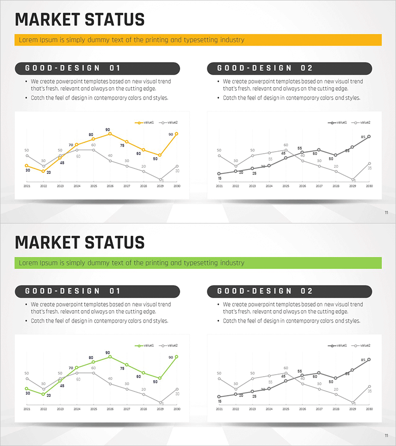
A PowerPoint slide featuring dual-series line charts to compare competitor market trends and performance metrics over time. The slide displays data from 2011 to 2030 with two distinct data series represented in yellow and black lines, with precise numerical values marked at each data point. The upper accent bar and clear title section provide strong visual hierarchy, and the 2-slide layout enables multiple market analysis scenarios. Ideal for business reports, investor presentations, strategy meetings, and competitive analysis discussions where market dynamics and performance comparisons need to be communicated persuasively.
Usage Points
-
Main Usage
Compares two key performance indicators—such as market share, sales trends, or growth rates—across competitors over an extended timeline. The dual-series format makes it easy to identify diverging trends, performance gaps, and market dynamics at a glance, supporting strategic planning and executive decision-making.
-
How to Use
Insert into the market overview section of business reports, competitive analysis slides in investor pitches, or trend analysis pages in executive briefings. Replace data points and legend labels with your actual figures, and customize the title and descriptive text to match your presentation context.
-
Recommended For
Marketing managers, business strategists, financial analysts, executive report owners, and consultants presenting market analysis and competitive positioning. Particularly suited for multi-year trend comparisons, quarterly performance reviews, and new business proposal decks.
-
Slide Structure
Both slides follow an identical layout with an upper accent bar (yellow or green), title section, and dual-series line chart. The X-axis spans 2011–2030 (annual intervals), the Y-axis ranges from 0–100, and two colored lines (yellow and black/green) represent different metrics. Numerical values are displayed at each data point for precise reference.
Related Products
-

Black Navy Broken Line Graph Table – Market and Competitor Analysis
#Market and Competitor Analysis #Diagram #Graph
-

Data Visualization Using Line Chart – Modern Design
#Market and Competitor Analysis #Graph #Competitor Analysis
-

Successful Business Analysis Line Graph
#Market and Competitor Analysis #Graph #Competitor Analysis
-

Competitor Analysis Graph for Market Capture
#Market and Competitor Analysis #Graph #Competitor Analysis
