Gradient Income Statement Table – Clearly Visualizing Financial Performance
RM0100005_31
- Last Update 01/26/2025
- File Size 0.3MB
- # of Slides 2
- File Format PPTX
- Slide Ratio 16:9
- Color
Keywords
About the Product
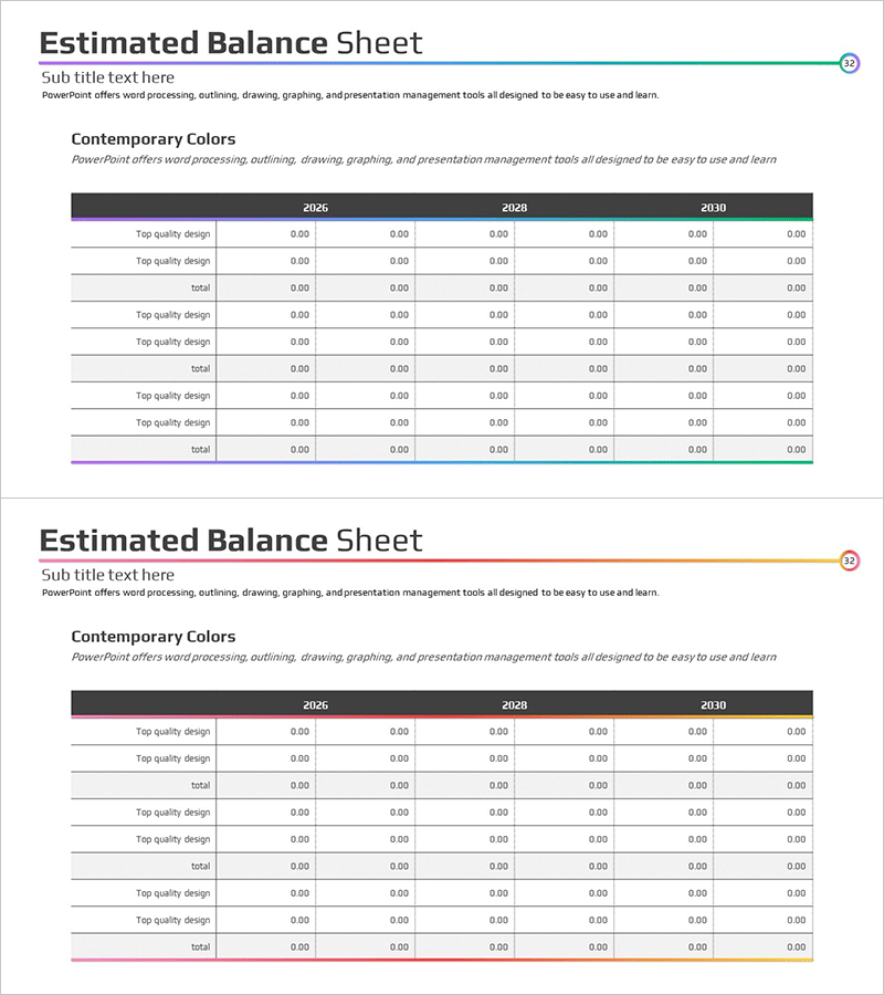
A financial PowerPoint slide that clearly visualizes income statement data across multiple years. This presentation template features a dark header with gradient-colored table rows, enabling side-by-side comparison of 2026, 2028, and 2030 financial figures. The slide accommodates six data categories per year with editable numeric fields, making it ideal for investor presentations, business plans, and financial reports. Provided in 16:9 widescreen PPTX format with flexible text and number input capabilities for diverse financial data representation.
Usage Points
-
Main Usage
This slide systematically organizes and visualizes financial performance data by presenting income statement components (revenue, expenses, profit) across multiple years for easy trend analysis. It effectively communicates financial health and growth potential to investors, employees, and business partners.
-
How to Use
Use as a core financial section slide in investor presentations, business plans, financial reports, and executive briefings. Simply input actual financial figures into each cell for automatic table formatting, reducing presentation preparation time. The year-over-year comparison format effectively highlights financial performance trends and changes.
-
Recommended For
Ideal for CFOs, finance managers, investor relations professionals, and executives presenting financial status. Suitable for startup pitch decks, quarterly and annual financial reports, and business proposals demonstrating financial viability. Essential for presentations requiring data-driven decision support.
-
Slide Structure
Two-slide layout with dark headers displaying years (2026, 2028, 2030) and gradient-colored rows representing six financial categories (Top quality design, total, etc.). Each cell is designed as an editable numeric input field in 0.00 format. The color gradient (dark at top to light at bottom) visually represents information hierarchy and data importance.
Related Products
-

Income Statement Table Chart – Overview of Financial Planning and Performance
#Financial Plans and Performance #Diagram #Balance Sheet
-

Last Year's Sales Comparison Analysis Table – Visually Representing Financial Performance
#Financial Plans and Performance #Diagram #Balance Sheet
-

Asset, Capital Structure Analysis Table - An Effective Tool for Financial Planning
#Financial Plans and Performance #Diagram #Balance Sheet
-

Yellow Green Income Statement Table – Efficient Financial Analysis
#Financial Plans and Performance #Diagram #Balance Sheet
