Graph of Sales by Region – Visualizing Market Status
RJ0900027_19
- Last Update 08/30/2025
- File Size 0.8MB
- # of Slides 2
- File Format PPTX
- Slide Ratio 16:9
- Color
Keywords
About the Product
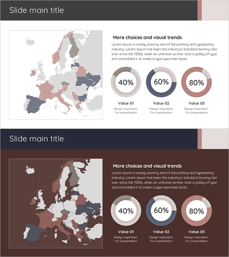
A 2-slide PowerPoint presentation set visualizing regional sales volume using donut charts. Three data values (40%, 60%, 80%) are distinguished by gray, navy, and burgundy tones, enabling quick market status assessment. The layout combines a Europe map with regional sales data, making it immediately applicable for international market analysis presentations and regional performance reports. Delivered in 16:9 widescreen PPTX format compatible with all presentation environments.
Usage Points
-
Main Usage
Visualize regional or divisional sales volume, market share, and performance ratios using donut charts to support data-driven decision-making in executive reports, quarterly performance presentations, and regional marketing strategy development.
-
How to Use
Slide 1 combines a Europe map with donut charts to display regional sales status; Slide 2 repeats the same structure on a dark background for flexible tone selection. Edit chart values and legends directly to input your actual data.
-
Recommended For
Sales and marketing teams analyzing regional performance, executive quarterly results reporting, international business market status explanation, investor presentations on regional expansion strategy, and consulting firms preparing market analysis materials.
-
Slide Structure
Slide 1: Light gray background + left Europe map (regions colored in gray, navy, burgundy) + right text area with 3 donut charts (40%, 60%, 80% labeled). Slide 2: Dark brown background + identical layout + white text. 16:9 aspect ratio, 2-slide set.
Related Products
-

Idea Presentation Template Wide – Market Analysis and Visualization
#Market and Competitor Analysis #Graph #Other
-

Residential Lighting Graph – Market Analysis
#Market and Competitor Analysis #Graph #Other
-

Industrial Data Report for Market Analysis Slides
#Market and Competitor Analysis #Diagram #Graph
-

3 Market Share Analysis – Differentiated Market Strategy
#Market and Competitor Analysis #Graph #Other
