3 Comparative Line Charts – Leading in Data Visualization
RJ0900003_8
- Last Update 08/29/2025
- File Size 0.1MB
- # of Slides 2
- File Format PPTX
- Slide Ratio 16:9
- Color
Keywords
About the Product
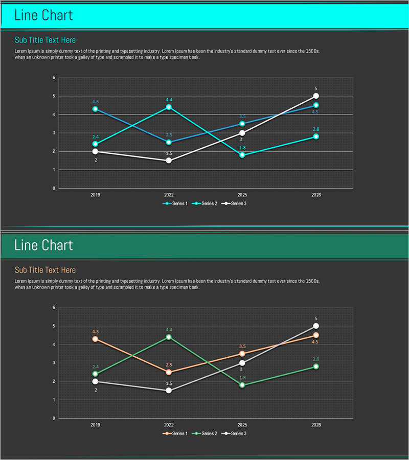
A multi-series line chart PowerPoint slide that visualizes three independent data sets simultaneously across time periods from 2019 to 2028. Each series is distinguished by distinct colors—cyan, orange, and white—enabling clear comparative analysis. The dark background with visible gridlines and labeled data points ensures precise numerical readability. This 2-slide template is ideal for presenting sales trends, customer metrics, market performance, and other multi-indicator analyses. The PPTX format allows immediate customization and data integration for business reports, financial presentations, and strategic reviews.
Usage Points
-
Main Usage
Simultaneously compare three or more data series and analyze trend changes over time. Identify correlations between sales volume, customer count, market share, and other key performance indicators at a glance. Suitable for executive dashboards, marketing analytics, financial performance reviews, and competitive benchmarking.
-
How to Use
Position this chart in the analysis or results section of your presentation to explain time-series data patterns. Align series colors with the legend, highlight inflection points or intersections to direct audience attention, and add detailed numerical interpretation in speaker notes to enhance credibility.
-
Recommended For
Data analysts, marketing managers, financial officers, and business intelligence professionals preparing quarterly reports, competitive analysis, customer behavior studies, and product performance reviews. Ideal for C-suite presentations and board-level strategic discussions.
-
Slide Structure
Two-slide template with each slide displaying three independent data series. Horizontal axis shows years (2019, 2022, 2025, 2028), vertical axis displays numerical range (0–6). Each series is represented by circular data points connected by lines, with a dark background grid for easy value reference and precise data interpretation.
Related Products
-

Analysis of Herbal Medicine Dashed Line Graph – Optimal for Competitive Analysis
#Market and Competitor Analysis #Graph #Competitor Analysis
-

Blue Green Competitive Analysis Broken Line Graph
#Market and Competitor Analysis #Diagram #Graph
-

Chemical Experiment Analysis Broken Line Graph – Insights and Data Visualization
#Market and Competitor Analysis #Diagram #Graph
-

Medical Development Data Analysis Graph – Market and Competitor Analysis
#Market and Competitor Analysis #Graph #Competitor Analysis
