Visual Representation of Transportation Preferences When Traveling – Donut Chart
RJ0600035_10
- Last Update 08/28/2025
- File Size 0.5MB
- # of Slides 2
- File Format PPTX
- Slide Ratio 16:9
- Color
Keywords
- #Content-Based Slides
- #Design-Based Slides
- #Market and Competitor Analysis
- #Marketing Plan and Strategy
- #Graph
- #Customer Analysis
- #Distribution Strategy
- #Circles
- #Doughnut Chart
- #16:9
- #donut chart PowerPoint
- #pie chart slide template
- #two-segment comparison graph
- #travel marketing PPT
- #preference survey visualization
- #circular graph PowerPoint download
About the Product
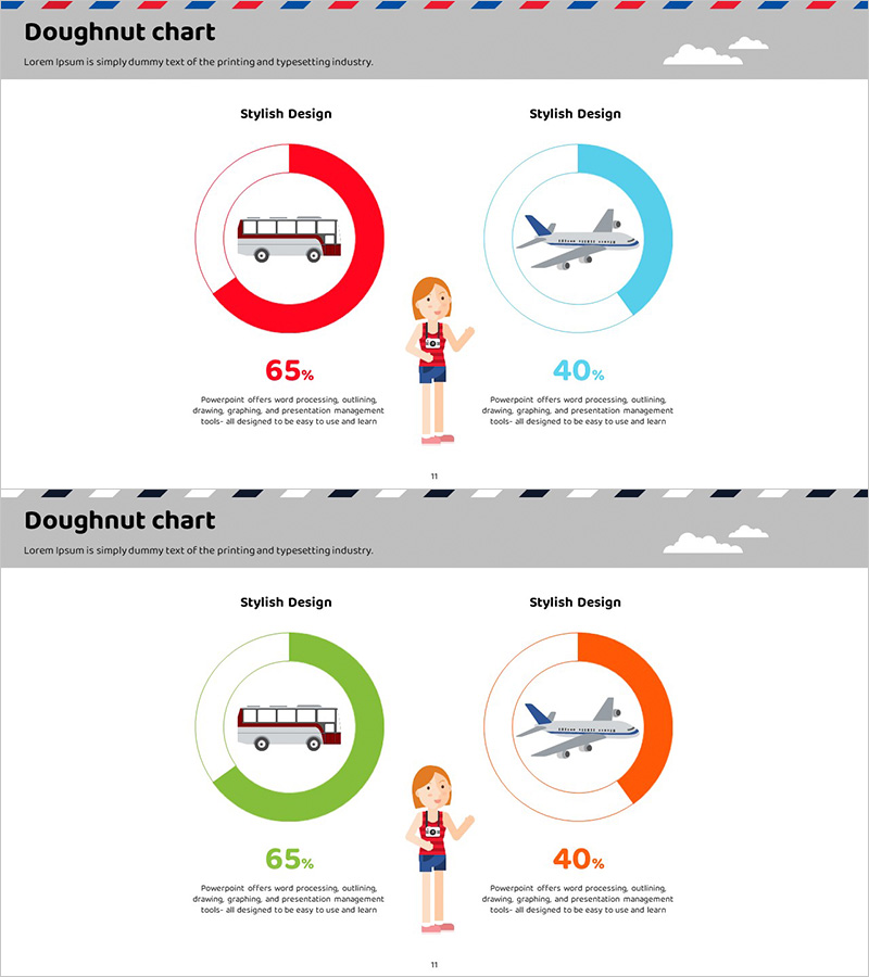
A PowerPoint slide featuring a two-segment donut chart that compares transportation preferences for travel. The circular graph uses red and blue color coding to distinguish between bus and airplane usage rates, with icons centered within each donut to visually reinforce category identification. Optimized for 16:9 widescreen format across 2 slides, this presentation template is ready for immediate use in customer preference surveys, marketing analysis, and distribution strategy presentations.
Usage Points
-
Main Usage
Visualizes customer preferences, market share, and comparative ratios using circular graph format. Ideal for travel, tourism, transportation, and logistics industries to present mode-of-transport usage analysis, marketing research findings, and distribution channel share comparisons.
-
How to Use
Open the slide and double-click the donut chart to edit values and labels with your own data. Colors, icons, and text are fully customizable; expand or reduce segments as needed. Copy and paste into presentations, reports, and proposals for seamless integration.
-
Recommended For
Marketing professionals, market research analysts, tourism and transportation planners, logistics managers, and executives preparing data-driven reports. Ideal for communicating customer preference analysis, competitive comparisons, channel-based revenue composition, and usage trend insights.
-
Slide Structure
Two-slide layout featuring dual two-segment donut charts per slide (red and blue color-coded). Each donut displays centered transportation icons (bus and airplane) for clear category identification, with percentage values (65%, 40%) and descriptive text areas below to support data interpretation.
Related Products
-

Silhouette Diagram & Circle Donut Graph – Visual Tool for Customer Analysis
#Product/Service Introduction #Market and Competitor Analysis #Graph
-

Bottled Beer Donut Chart – Market Share Visualization
#Market and Competitor Analysis #Marketing Plan and Strategy #Graph
-

Customer Analysis and Market Share Graph – Harmony of Blue and Red
#Market and Competitor Analysis #Graph #Other
-

Gender Ratio Customer Analysis Pie Chart – Emphasizing Customer Insights
#Market and Competitor Analysis #Graph #Other
