Green Purple Radial Chart Analysis – Capturing Visual Strengths
RJ0900034_16
- Last Update 08/26/2025
- File Size 0.7MB
- # of Slides 2
- File Format PPTX
- Slide Ratio 16:9
- Color
Keywords
- #Content-Based Slides
- #Design-Based Slides
- #Product/Service Introduction
- #Graph
- #Features
- #Benefits and Advantages
- #Other
- #Radar Chart Spider Chart
- #16:9
- #radial chart PowerPoint
- #6-axis data visualization slide
- #radial graph template
- #multi-metric comparison PPT
- #how to create radial chart in PowerPoint
- #radial diagram presentation slide
About the Product
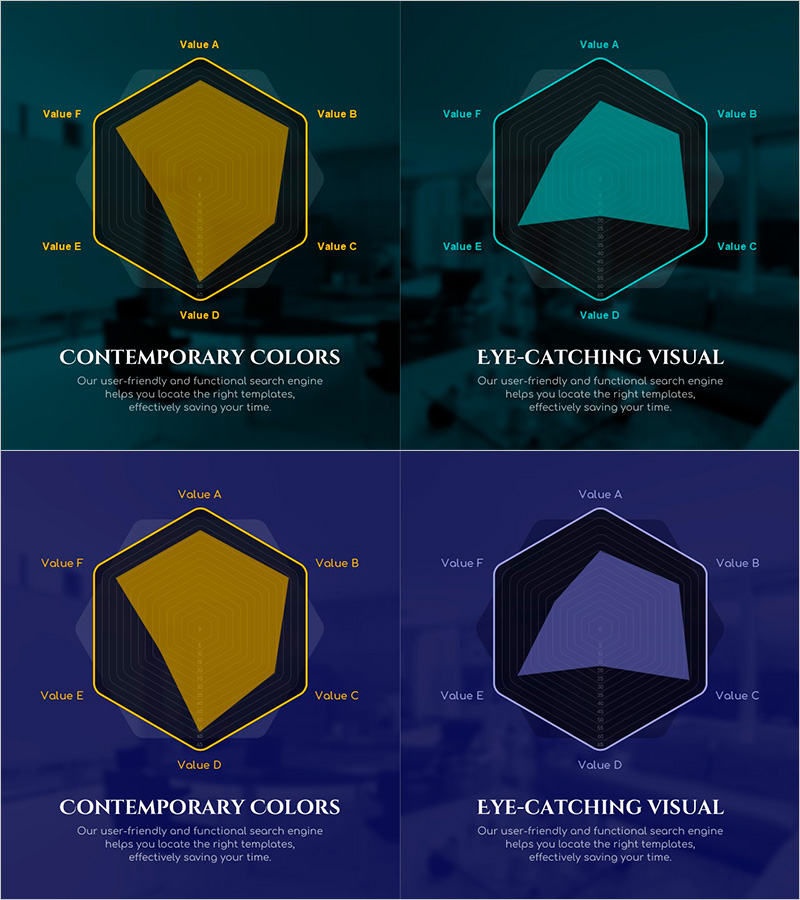
A PowerPoint slide template that visualizes six data points in a radial chart format using green and purple dual-tone colors for strong contrast. Each axis is labeled Value A through F, making it ideal for comparing multiple metrics simultaneously. Two design variations (Contemporary Colors and Eye-Catching Visual) are included, allowing you to select the style that best matches your presentation context and audience. The 2-slide deck in 16:9 widescreen format is fully editable and ready to use for marketing analysis, performance reviews, competency assessments, and strategic presentations.
Usage Points
-
Main Usage
Enables simultaneous comparison and analysis of six performance metrics, competencies, or indicators. The radial structure allows viewers to instantly grasp the relative magnitude of each axis, making it effective for organizational capability assessments, product feature comparisons, and market analysis.
-
How to Use
Input numerical values for each axis (Value A through F) and the chart shape automatically scales proportionally. The green-purple dual-tone color scheme can distinguish between two categories or represent positive and negative dimensions. Choose between the two design variations based on your presentation tone and audience expectations.
-
Recommended For
Ideal for executive reports, marketing strategy presentations, HR competency evaluations, product competitive analysis, and consulting proposals. Particularly suited for B2B presentations and data-driven decision-making meetings where multiple indicators must be compared simultaneously.
-
Slide Structure
A regular hexagon radial chart with six axes (Value A, B, C, D, E, F). Concentric circular gridlines clearly indicate numerical scales, and two design variations with green and purple fill options are provided. Each slide includes a title and description text area at the bottom for contextual explanation.
Related Products
-

Food Ingredient Characteristics Radar Chart – Features and Benefits
#Product/Service Introduction #Diagram #Graph
-

Visualizing Features and Benefits with Radial Charts
#Product/Service Introduction #Diagram #Graph
-

Highlighting Product Features with Four Radial Graphs
#Product/Service Introduction #Graph #Features
-

Presentation Template Highlighting Characteristics of Interior Work – Stylish Design
#Product/Service Introduction #Features #Benefits and Advantages
