Market Comparison Analysis Broken Line Graph – Competitor Analysis and Visual Impact
RM0100002_10
- Last Update 01/24/2025
- File Size 0.4MB
- # of Slides 4
- File Format PPTX
- Slide Ratio 16:9
- Color
Keywords
- #Content-Based Slides
- #Design-Based Slides
- #Market and Competitor Analysis
- #Diagram
- #Graph
- #Competitor Analysis
- #Market Analysis
- #Table
- #Line
- #Standard Table
- #Line Chart
- #16:9
- #broken line chart PowerPoint
- #market analysis slide template
- #competitor comparison chart
- #trend analysis presentation
- #data visualization PPT download
About the Product
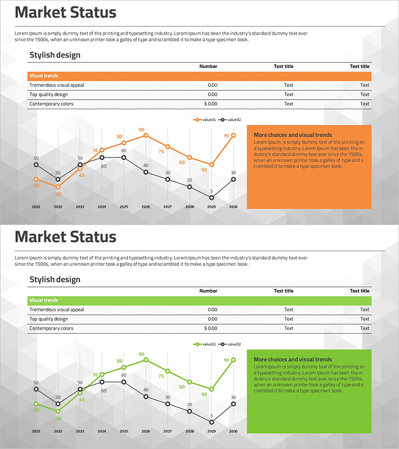
A PowerPoint slide featuring a dual-series broken line chart designed to compare market trends and competitor performance at a glance. The chart visualizes data from 2021 to 2030 using orange and black line series, with numeric labels at each data point for precise value comparison. A table displaying key metrics (Visual trends, Tremendous visual appeal, Top quality design, Contemporary colors) and an emphasis text box are positioned to enhance presentation effectiveness. This 4-slide set in 16:9 widescreen format is ready to edit and deploy immediately for your analysis presentations.
Usage Points
-
Main Usage
Optimized for visualizing market trends, comparing competitor performance, and illustrating year-over-year changes. The dual-series format enables simultaneous data representation for easy comparative analysis, while numeric labels on each data point ensure accurate information delivery.
-
How to Use
Use in strategy reports, market analysis presentations, and executive briefings to explain competitive positioning. Simply replace the series names (value01, value02) and numeric values with your own data, then add key insights to the emphasis text box to amplify presentation impact.
-
Recommended For
Marketing professionals, strategic planning teams, sales managers, and executives presenting market conditions and competitive strategies. Particularly effective for quarterly or annual performance comparisons, industry trend analysis, and competitive benchmarking documentation.
-
Slide Structure
Four slides featuring dual-series broken line charts with orange and black lines as the focal point. Numeric labels (ranging 0–90) appear above each data point, while an orange-background emphasis box is positioned on the right to highlight key messages. A table of key metrics is organized at the top of each slide.
Related Products
-

Competitive Market Analysis Graph - Insights for Understanding the Market
#Market and Competitor Analysis #Diagram #Graph
-

Competitor Market Analysis Table – Strategic Insights
#Market and Competitor Analysis #Diagram #Graph
-

Target Market Trend Analysis Graph by Year – Market and Competitor Analysis
#Market and Competitor Analysis #Diagram #Graph
-

Black Navy Broken Line Graph Table – Market and Competitor Analysis
#Market and Competitor Analysis #Diagram #Graph
