Household Size Preference Survey Visualized with Donut Chart
RJ0900027_6
- Last Update 08/24/2025
- File Size 0.3MB
- # of Slides 2
- File Format PPTX
- Slide Ratio 16:9
- Color
Keywords
- #Content-Based Slides
- #Design-Based Slides
- #Market and Competitor Analysis
- #Graph
- #Market Status
- #Market Share
- #Circles
- #Doughnut Chart
- #16:9
- #donut chart PowerPoint slide
- #pie chart template
- #ratio comparison visualization
- #market analysis presentation
- #data visualization slide
- #how to create donut chart in PowerPoint
About the Product
A donut chart PowerPoint slide designed to visualize categorical ratios such as household size preferences and market segmentation. The 2-slide set features a harmonious color palette with mauve and rose tones as primary colors, complemented by navy and gray accents. Each donut chart includes a center label area and left-aligned icons with percentage values for clear data communication. Ideal for market analysis presentations, customer preference surveys, product positioning discussions, and business performance reports that require immediate deployment.
Usage Points
-
Main Usage
This donut chart slide intuitively represents categorical ratio relationships with a center label area for additional information. The combination of left-aligned icons and percentage values enhances data clarity. Effectively communicates market size, customer preferences, product composition ratios, and business segment contributions.
-
How to Use
Deploy in market analysis sections to explain customer segmentation, product portfolio composition, and regional sales distribution. In investor pitch decks, visualize target market size and market share. In business reports, illustrate departmental or business unit contribution rates. Customize chart colors and values to match your actual data while maintaining the professional design structure.
-
Recommended For
Marketing managers, business strategists, financial analysts, and consultants who need to present data-driven insights. Suitable for market research presentations, customer segmentation strategy discussions, product positioning pitches, investor relations meetings, and quarterly business performance reviews.
-
Slide Structure
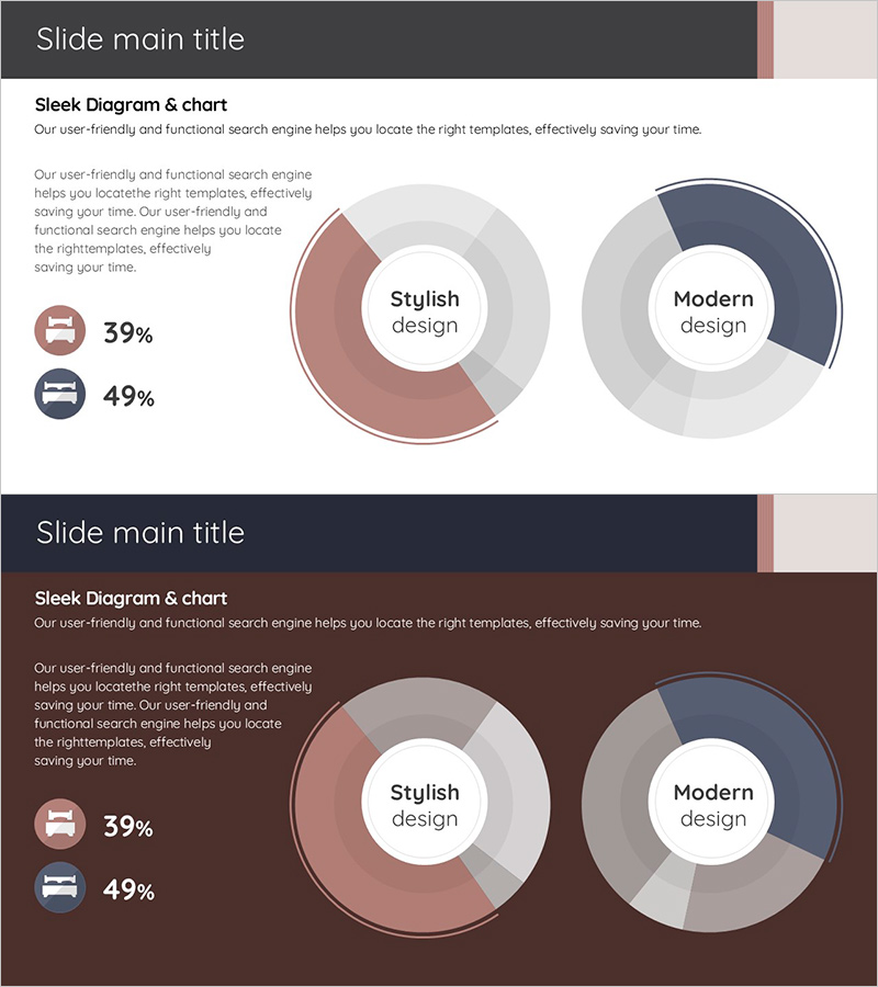
Two-slide layout with two donut charts per slide. Each donut features a center label area (e.g., 'Stylish design', 'Modern design') and left-side icons with percentage values (39%, 49%, etc.). Multi-layered color scheme using mauve, navy, and gray tones to differentiate segments. Optimized for 16:9 widescreen format with balanced white space and professional typography.
Related Products
-

Doughnut Chart Visualizing Proportion of Grain Yields
#Market and Competitor Analysis #Graph #Market Status
-

Visualizing Fish Market Share with Doughnut Chart – Vitality of the Ocean
#Market and Competitor Analysis #Graph #Market Status
-

How to Protect Your Environment Pie Chart
#Market and Competitor Analysis #Graph #Market Status
-

Pie Chart for Decimal Ratio Analysis – Market Share Status
#Market and Competitor Analysis #Graph #Market Status
