Data Trends Graph – Efficient Data Visualization
RJ0900027_23
- Last Update 08/24/2025
- File Size 0.3MB
- # of Slides 2
- File Format PPTX
- Slide Ratio 16:9
- Color
Keywords
About the Product
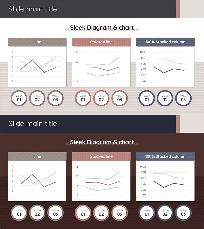
A comprehensive line chart PowerPoint slide designed to visualize data trends and changes over time. This template presents three distinct chart types—line graph, stacked line graph, and 100% stacked column chart—in a single layout, enabling multi-dimensional data analysis. The design uses a coordinated color palette of gray, rose, and navy to differentiate data series, with circular value indicators (Value 01–03) at the bottom for intuitive data point identification. Formatted in 16:9 widescreen ratio across 2 slides, this presentation template is ready for immediate use in business reports, marketing analysis, financial presentations, and executive dashboards.
Usage Points
-
Main Usage
Visualize time-series data changes across multiple data series for comparative trend analysis. Ideal for displaying sales performance, customer growth, market share evolution, and other metrics that change over specific time periods, supporting data-driven decision-making.
-
How to Use
Input your data values into each chart, and the graphs automatically update. Modify the circular indicators at the bottom to reflect your time units (quarters, months, years). Customize colors to match your corporate brand, and freely adjust chart sizes and positions to fit your presentation layout.
-
Recommended For
Finance teams presenting quarterly earnings reports, marketing teams analyzing campaign performance, sales teams showcasing revenue trends, and executives delivering business performance updates. Suitable for any data-driven presentation requiring multi-series trend comparison.
-
Slide Structure
Slide 1: Three-column layout with line graph (2–3 series), stacked line graph (2–3 series), and 100% stacked column chart (3–4 series). Chart type labels displayed above each visualization. Slide 2: Identical layout with dark background theme. Three circular value indicators (Value 01–03) positioned at the bottom to emphasize data points.
Related Products
-

Competitor Analysis Broken Line Graph – Market Insights Provided
#Market and Competitor Analysis #Graph #Competitor Analysis
-

Medical Development Data Analysis Graph – Market and Competitor Analysis
#Market and Competitor Analysis #Graph #Competitor Analysis
-

Virus Analysis Broken Line Graph – Market and Competitor Analysis
#Market and Competitor Analysis #Graph #Competitor Analysis
-

Analysis of Herbal Medicine Dashed Line Graph – Optimal for Competitive Analysis
#Market and Competitor Analysis #Graph #Competitor Analysis
