Performance Status Graph by Period – Systematic Analysis
RJ0900027_15
- Last Update 08/24/2025
- File Size 0.9MB
- # of Slides 2
- File Format PPTX
- Slide Ratio 16:9
- Color
Keywords
About the Product
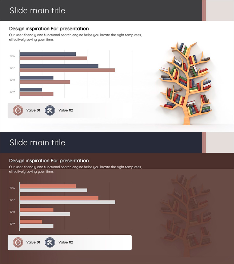
A horizontal bar chart PowerPoint slide that clearly visualizes performance status by period. This slide template compares data across 5 years (2016–2019) using 2 data series, making it ideal for business performance reports and quarterly results presentations. The design uses contrasting charcoal gray and rose tones to distinguish data series, with legend icons for clear identification. The 2-slide set includes both light and dark background versions, allowing you to choose the design that best fits your presentation environment.
Usage Points
-
Main Usage
Visualize and compare performance data across multiple years or periods using 2 or more data series, enabling stakeholders to grasp performance trends at a glance. Optimized for quantitative data-driven presentations such as business performance reports, results analysis, and marketing performance reviews.
-
How to Use
Bar length and color represent each year and data series value, allowing intuitive comparison. Legend icons clearly distinguish Value 01 and Value 02. Customize the title, description text, and data values to match your specific performance metrics and presentation context.
-
Recommended For
CFOs, finance managers, business operations managers, and marketing professionals presenting period-by-period or year-over-year results to executives and investors. Suitable for business plans, performance reports, investor pitch decks, and marketing strategy presentations.
-
Slide Structure
2-slide set: Slide 1 features a light background (light gray and white) with charcoal and rose-toned bars; Slide 2 uses a dark background (dark brown) with the same color palette. Each slide contains a horizontal bar chart with 5 year rows × 2 data series columns, legend with icons, title area, and descriptive text section.
Related Products
-

Competitor Analysis Graph & Table by Year
#Market and Competitor Analysis #Diagram #Graph
-

Analysis of User Gender Ratio by Target Country – Providing Market Insights
#Market and Competitor Analysis #Graph #Other
-

Sales and Profit Comparison Graph & Table – Clear Financial Analysis
#Financial Plans and Performance #Diagram #Graph
-

Visualizing Internet of Things Market Trends with Bar Chart
#Market and Competitor Analysis #Graph #Market Analysis
