Survey Graph of Quality of Life Satisfaction by Living Environment – Market Analysis Slide
RJ0900026_28
- Last Update 08/24/2025
- File Size 1MB
- # of Slides 2
- File Format PPTX
- Slide Ratio 16:9
- Color
Keywords
- #Content-Based Slides
- #Design-Based Slides
- #Market and Competitor Analysis
- #Graph
- #Other
- #Market Analysis
- #Column
- #Grouped Column
- #Mockup
- #16:9
- #living environment satisfaction chart
- #quality of life survey PowerPoint
- #horizontal bar graph slide
- #market analysis presentation
- #data visualization slide template
About the Product
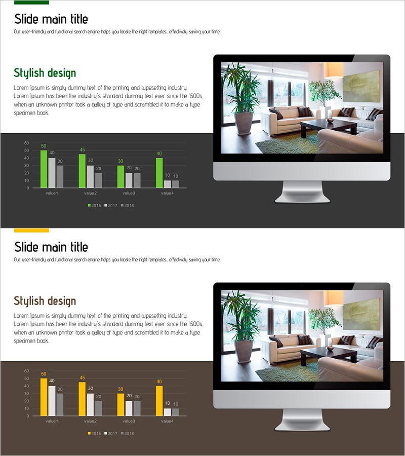
A PowerPoint slide visualizing quality of life satisfaction by living environment using horizontal bar charts. The design features contrasting green and yellow colors to represent four data items (value1–value4) across three years (2016, 2017, 2018). The left side includes a text description area, while the right side displays a living room interior mockup image, making it ideal for market analysis presentations. This 16:9 ratio, 2-slide set is ready for immediate editing and use.
Usage Points
-
Main Usage
Clearly visualize consumer satisfaction data by living environment for market analysis reports, consumer research presentations, and real estate or residential marketing materials. The year-over-year and item-by-item comparison effectively supports decision-making and insight presentation.
-
How to Use
Enter analysis content and insights in the left text area, and insert relevant living environment photos or product images in the right mockup area. Replace the bar chart values with your actual data and use the slide in presentations or embed it in reports.
-
Recommended For
Marketing teams in real estate, construction, and residential sectors; market research professionals; consumer psychology analysts; urban planners and policymakers; and interior design and furniture company strategists presenting consumer satisfaction survey results.
-
Slide Structure
Two-slide layout with each slide divided into a left text area (title and description) and a right visual element area. The horizontal bar chart displays four items across three year-series (2016, 2017, 2018) with 12 total data points differentiated by green, yellow, and gray colors. A living room interior mockup image reinforces the residential context.
Related Products
-

Laptop Mockup Bar Graph – Essential Slide for Competitor Analysis
#Market and Competitor Analysis #Graph #Other
-

PC Mockup & Column Bundle Graph
#Market and Competitor Analysis #Graph #Other
-

Competitor Capability Analysis Chart – Efficient Market Analysis
#Market and Competitor Analysis #Graph #Competitor Analysis
-

Climbing and Physical Strength Graph – Visualizing Market Analysis Results
#Market and Competitor Analysis #Graph #Market Analysis
