Visualizing Market Share with Plus Donut Chart
RJ0900025_22
- Last Update 08/23/2025
- File Size 2.5MB
- # of Slides 2
- File Format PPTX
- Slide Ratio 16:9
- Color
Keywords
- #Content-Based Slides
- #Design-Based Slides
- #Market and Competitor Analysis
- #Diagram
- #Graph
- #Market Status
- #Market Share
- #Cluster
- #Circles
- #Chain Diagram
- #Doughnut Chart
- #16:9
- #donut chart PowerPoint
- #pie chart slide template
- #ratio comparison presentation
- #market share visualization
- #donut graph download
- #data visualization slides
About the Product
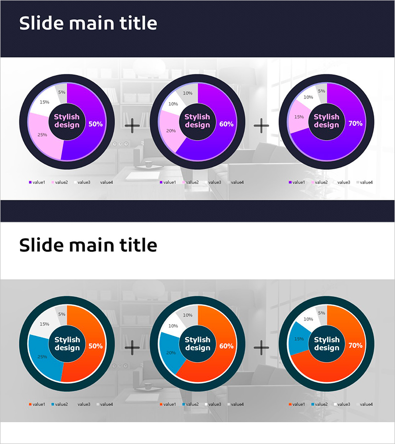
A professional donut chart PowerPoint slide template designed to visualize market share, competitive analysis, revenue composition, and distribution data. Features two distinct donut chart layouts in purple and pink tones, each divided into four segments for comprehensive data representation. The circular center area accommodates key metrics, percentages, or titles to emphasize critical information. Ideal for presenting departmental sales, customer demographics, product category breakdowns, and multi-dimensional comparisons. Delivered as 2 fully editable slides in 16:9 widescreen format, ready for immediate integration into business presentations.
Usage Points
-
Main Usage
Effectively communicate proportional data such as market share, competitive positioning, revenue streams, and customer segmentation through circular graph visualization. The central hub area highlights key metrics or percentages, drawing audience focus to critical data points.
-
How to Use
Select each donut segment to input corresponding data values and percentages. Populate the center text area with titles, key figures, or performance metrics. Leverage both chart layouts to present time-series comparisons, geographic breakdowns, departmental performance, or multi-scenario analysis within a single presentation.
-
Recommended For
Financial reports, business analysis presentations, marketing strategy briefings, quarterly performance reviews, and executive-level presentations. Particularly valuable for finance professionals, business analysts, marketing strategists, and management teams requiring data-driven decision support.
-
Slide Structure
Two-slide template featuring dual donut charts per slide, each segmented into four distinct data categories. Central circular text zones enable emphasis of key metrics or messaging. Purple and pink color palette ensures clear visual differentiation between data segments and maintains professional presentation standards.
Related Products
-

Visualizing Market Share with Detailed Item Analysis Chart
#Market and Competitor Analysis #Diagram #Graph
-

Eco-friendly Donut Chart Analysis – Market Status Delivery
#Market and Competitor Analysis #Graph #Market Status
-

Office Desk Donut Chart Analysis – Visualizing Market Share
#Market and Competitor Analysis #Graph #Market Status
-

Doughnut Chart Visualizing Proportion of Grain Yields
#Market and Competitor Analysis #Graph #Market Status
