Donut Chart: Feature Usage Ratio in Mobile Banking
RB0100049_4
- Last Update 03/06/2025
- File Size 0.4MB
- # of Slides 2
- File Format PPTX
- Slide Ratio 4:3
- Color
Keywords
- #Content-Based Slides
- #Design-Based Slides
- #Market and Competitor Analysis
- #Diagram
- #Graph
- #Market Status
- #Market Share
- #Table
- #Circles
- #Standard Table
- #Doughnut Chart
- #4:3
- #donut chart PowerPoint
- #pie chart slide template
- #feature usage ratio visualization
- #mobile banking chart
- #data visualization slide
- #how to create donut chart in PowerPoint
About the Product
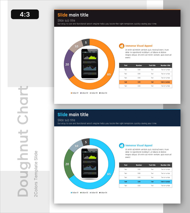
A professional donut chart PowerPoint slide visualizing feature usage ratios across mobile banking services. The design features a central mobile device image surrounded by a four-segment donut chart in orange, purple, gray, and blue, displaying usage percentages (65%, 20%, 10%, 5%) for each banking feature. A detailed data table on the right side provides numerical context for comprehensive presentations. This slide template is ready-to-use for fintech, financial services, and market analysis presentations.
Usage Points
-
Main Usage
Clearly communicate feature adoption rates and user behavior patterns in mobile banking services. The four-segment donut chart provides intuitive visual comparison of usage percentages, while the central mobile device reinforces the mobile banking context.
-
How to Use
Ideal for financial institution presentations, fintech market analysis reports, and mobile service performance reviews. Replace sample data in the accompanying table with actual metrics to create data-driven presentations for stakeholder meetings and investor pitches.
-
Recommended For
Financial analysts, fintech product managers, business development professionals, and market research teams. Effective for presenting mobile service adoption metrics, customer segmentation data, feature-based revenue distribution, and user behavior analysis.
-
Slide Structure
Two slides in 4:3 aspect ratio with identical layouts and different color schemes. Each slide features a left-aligned donut chart with centered mobile device image and a right-aligned data table (5 rows × 4 columns) for numerical details.
Related Products
-

Eucalyptus Donut Chart – Visualization for Market Analysis
#Market and Competitor Analysis #Graph #Market Status
-

Travel Plan Donut Chart – Market Share Analysis
#Market and Competitor Analysis #Graph #Market Status
-

Leaf Illustration Donut Chart - Visualizing Market Share
#Market and Competitor Analysis #Graph #Market Status
-

Visualized Travel Transportation Preference Survey with Doughnut Chart
#Market and Competitor Analysis #Graph #Market Status
