Highest Selling Graph – Visualizing Marketing Performance
RJ0900023_11
- Last Update 08/22/2025
- File Size 0.3MB
- # of Slides 2
- File Format PPTX
- Slide Ratio 16:9
- Color
Keywords
- #Content-Based Slides
- #Design-Based Slides
- #Marketing Plan and Strategy
- #Financial Plans and Performance
- #Graph
- #Marketing Objectives
- #Sales and Revenue
- #Line
- #Line Chart
- #16:9
- #line graph PowerPoint
- #sales trend presentation slide
- #marketing performance chart
- #dual-series data visualization
- #trend analysis PowerPoint template
About the Product
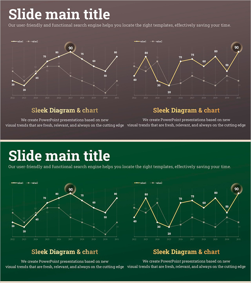
A line graph PowerPoint slide designed to compare marketing performance and sales results over time with dual data series. This presentation template visualizes trend changes clearly using two distinct data lines on a dark background with gold and white accents. The high-contrast design enhances visual impact for business presentations. Ideal for monthly, quarterly, or annual performance comparisons, marketing campaign effectiveness analysis, and financial results presentations. Includes 2 slides in 16:9 widescreen format, fully editable PPTX file with customizable data points and labels.
Usage Points
-
Main Usage
Compare monthly, quarterly, or annual sales results and marketing performance simultaneously to communicate trend changes visually. The intersection points of the two data lines reveal performance gaps at a glance, while numeric labels ensure accurate data communication and support detailed analysis.
-
How to Use
Use in marketing strategy presentations, quarterly performance reports, campaign effectiveness analysis, and financial results meetings where trend comparison is essential. The dark background design remains clear on projectors, and gold accent colors highlight key data points for audience focus.
-
Recommended For
Marketing managers, sales directors, financial analysts, and executives presenting performance reports benefit from this template. Particularly effective when comparing two departments, products, or channels, or when emphasizing time-based trend changes and performance trajectories.
-
Slide Structure
Each slide features two line graphs positioned side-by-side or stacked to represent different data sets. X-axis displays months, quarters, or years; Y-axis shows numeric scale. Data points include numeric labels for precision. Gold and white lines contrast against dark grid background for maximum visibility and professional appearance.
Related Products
-

Business Operation Cost Analysis Graph – Core of Financial Planning
#Financial Plans and Performance #Diagram #Graph
-

Comparison Graph by Transportation Industry – Market Analysis and Financial Performance
#Market and Competitor Analysis #Financial Plans and Performance #Graph
-

Simple Car Wide Presentation Line Chart – Market and Competitive Analysis
#Market and Competitor Analysis #Financial Plans and Performance #Graph
-

Business Outlook Analysis Chart – Future Predictions and Planning
#Financial Plans and Performance #Diagram #Graph
