Sales Graphs and Strategies – Effective Decision Making through Data Visualization
RJ0900021_11
- Last Update 08/22/2025
- File Size 0.1MB
- # of Slides 2
- File Format PPTX
- Slide Ratio 16:9
- Color
Keywords
About the Product
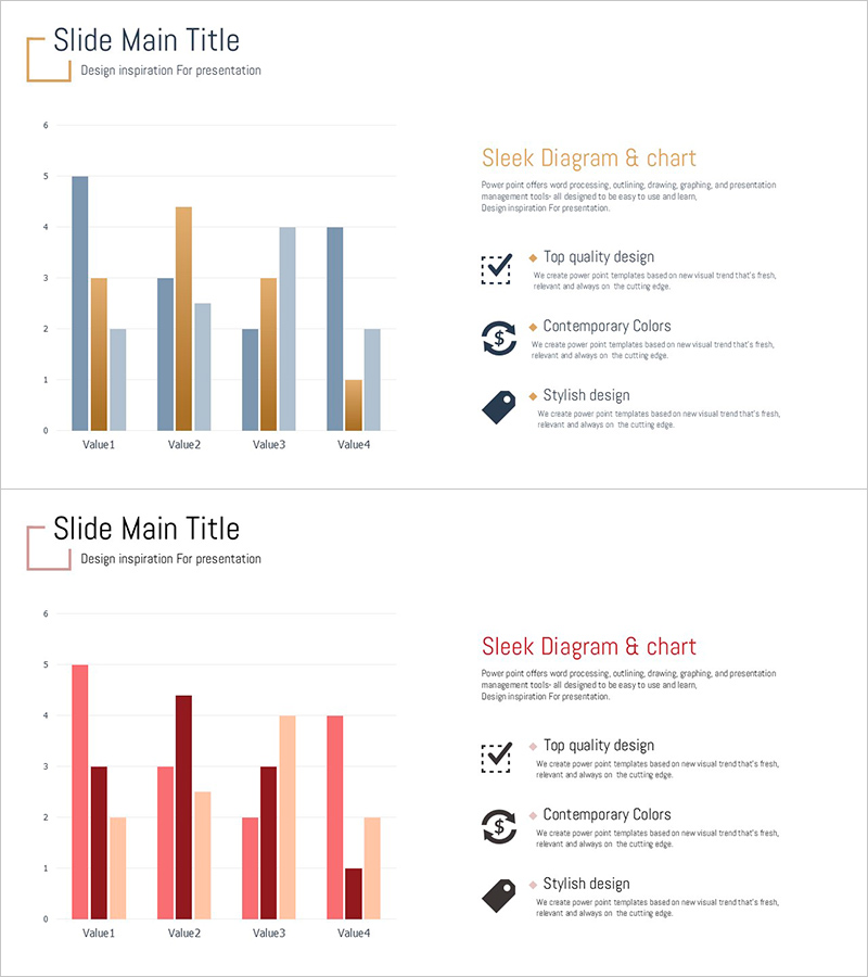
A 2-slide grouped bar chart PowerPoint presentation template featuring 4 items (Value1 through Value4) with 2-3 data series displayed side-by-side for simultaneous item-to-item comparison and series trend analysis. The first slide uses beige, gray, and orange tones while the second employs red, burgundy, and apricot colors, accommodating diverse presentation contexts. Each slide positions a grouped bar chart on the left with three key messaging points (Top quality design, Contemporary Colors, Stylish design) accompanied by icons on the right, enabling integrated data storytelling and strategic communication. Immediately applicable to business presentations including sales reports, market analysis, and performance comparisons.
Usage Points
-
Main Usage
Displays 4 items with 2-3 data series in grouped format, enabling simultaneous comparison across items and trend analysis across series. Effectively visualizes multi-dimensional metrics such as revenue, sales volume, market share, and customer satisfaction for clear decision-making support.
-
How to Use
Integrate into business reports, executive briefings, quarterly performance presentations, and market analysis decks during results comparison sections. Customize the right-side messaging area with strategies, improvement initiatives, and targets to emphasize data-driven decision processes.
-
Recommended For
Finance, sales, and marketing professionals presenting quarterly or annual performance to executives, investors, and clients. Particularly valuable when comparing results across multiple products, regions, or channels to enhance data credibility.
-
Slide Structure
2-slide layout. Each slide features a grouped bar chart (4 items × 2-3 series) on the left and a title (Sleek Diagram & chart) with 3 key points (icon + text) on the right. Slide 1 uses beige, gray, and orange palette; Slide 2 uses red, burgundy, and apricot for color variety.
Related Products
-

Bar Chart & Income Statement Table – Market Analysis and Financial Performance
#Market and Competitor Analysis #Financial Plans and Performance #Diagram
-

Horizontal Bar Graph for Competitor Analysis – Effective Data Visualization
#Market and Competitor Analysis #Graph #Competitor Analysis
-

Red Blue Positioning Slide – Visualizing Marketing Strategies
#Marketing Plan and Strategy #Graph #Other
-

User Gender Ratio Analysis Graph – Visualizing Market Share
#Market and Competitor Analysis #Graph #Customer Analysis
