Competitive Analysis Bar Graph – Effective Market Comparison Visualization
RM0100001_13
- Last Update 01/24/2025
- File Size 2MB
- # of Slides 2
- File Format PPTX
- Slide Ratio 16:9
- Color
Keywords
About the Product
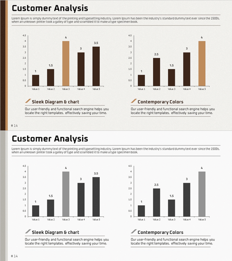
A 2-slide bar chart PowerPoint template optimized for competitive analysis and market comparison presentations. The slides feature horizontal bar graphs with dual-tone coloring—brown and gray—to clearly distinguish two data series across five items (Value 1 through Value 5). Each slide includes a 'Customer Analysis' title section and descriptive text area, making it ready for immediate use in business reports and presentations. Formatted in 16:9 widescreen PPTX, fully editable in all presentation software.
Usage Points
-
Main Usage
Visualize comparative data across five categories—such as competitor analysis, market share comparison, customer satisfaction ratings, or sales performance metrics—using horizontal bars to instantly convey relative magnitude and ranking.
-
How to Use
Insert into business plans, marketing proposals, or quarterly reports' analysis sections to support data-driven decision-making. Maintain the brown-gray color scheme or customize with corporate brand colors for seamless integration.
-
Recommended For
Ideal for executive presentations, investor pitch decks, marketing strategy meetings, sales presentations, and consulting proposals. Recommended for business leaders, data analysts, marketers, and sales professionals who need to present comparative metrics.
-
Slide Structure
Two-slide set with consistent layout: 'Customer Analysis' title, descriptive text area, and horizontal bar graph displaying five data points (Value 1–5). First slide uses brown-toned bars; second slide uses gray-toned bars to represent dual data series comparison.
Related Products
-

Natural Landscape Illustration Graph – Market Status and Competitive Advantage
#Market and Competitor Analysis #Graph #Other
-

Budget Allocation by Strategic Focus
#Business Introduction #Market and Competitor Analysis #Graph
-

3 Market Share Analysis – Differentiated Market Strategy
#Market and Competitor Analysis #Graph #Other
-

Market Demand Analysis PowerPoint Slide – Donut Chart Layout
#Market and Competitor Analysis #Graph #Customer Analysis
