Curve Graph Slide for Analyzing Regional Figures – Effective Data Delivery
RJ0900019_27
- Last Update 08/21/2025
- File Size 2.3MB
- # of Slides 2
- File Format PPTX
- Slide Ratio 16:9
- Color
Keywords
About the Product
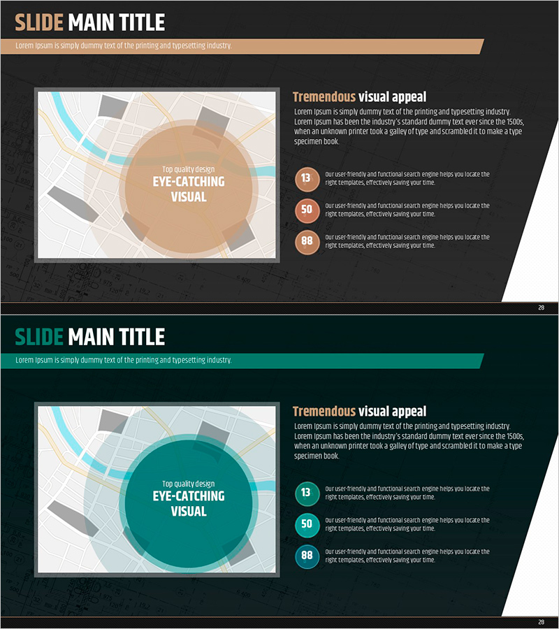
A professional curve graph PowerPoint slide designed to effectively communicate regional market data and numerical analysis. Features a two-tone color scheme combining tan and teal backgrounds with circular emphasis areas and numbered text descriptions that transform complex figures into intuitive visual representations. This 2-slide, 16:9 aspect ratio PPTX template is ready for immediate use in market analysis presentations, competitive analysis reports, and regional performance reviews. Clear separation between text input areas and data visualization zones streamlines presentation creation and ensures consistent professional appearance across slides.
Usage Points
-
Main Usage
Designed to visually represent regional market conditions, competitive market share, sales trends, and other numerical analysis data. The circular emphasis areas combined with numbered explanation structure enable step-by-step communication of complex information, making it ideal for executive decision-support materials.
-
How to Use
Deploy this slide in market analysis, competitive analysis, and regional performance reporting sections to explain key metrics and insights. Simply input your analysis content in the text areas and populate the graph region with actual data to create a polished, professional presentation.
-
Recommended For
Marketing managers, sales directors, business analysts, management consultants, and executives presenting market conditions, regional sales performance, and competitive landscape analysis will find this template particularly effective.
-
Slide Structure
Two-slide set with tan background on slide 1 and teal on slide 2. Each slide features a curve graph area on the left and title with three numbered explanation points (13, 50, 88) on the right, enabling comparative analysis and sequential explanation of data insights.
Related Products
-

Doughnut Chart Slide Visualizing Market Share by Country
#Market and Competitor Analysis #Graph #Other
-

Marketing Effectiveness Analysis Mixed Graph – Insights into Market Trends
#Market and Competitor Analysis #Graph #Other
-

Regional Outlook Graph – Visualizing Market Status
#Market and Competitor Analysis #Graph #Other
-

Data Insights Enhanced by Highlighted Metrics
#Market and Competitor Analysis #Graph #Other
