Organization Headcount Doughnut Chart – Visualizing Operational Plans
RJ0900017_6
- Last Update 08/21/2025
- File Size 0.3MB
- # of Slides 2
- File Format PPTX
- Slide Ratio 16:9
- Color
Keywords
- #Content-Based Slides
- #Design-Based Slides
- #Operational Plan
- #Graph
- #Production and Technology Development Strategy
- #Organizational Structure and Staffing Plan
- #Circles
- #Doughnut Chart
- #16:9
- #doughnut chart PowerPoint
- #organization headcount slide
- #pie chart template
- #organizational structure visualization
- #PowerPoint graph slide
- #ratio chart template
About the Product
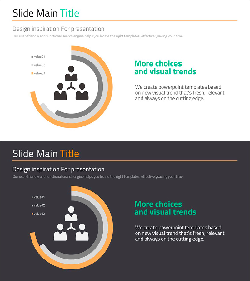
A doughnut chart PowerPoint slide that visually represents your organization's headcount distribution and departmental structure. The design features a centered organization icon surrounded by three concentric rings in orange, gray, and charcoal tones, clearly distinguishing value01, value02, and value03 through a legend. This slide deck is ready to use for operational planning presentations, organizational overview reports, and workforce allocation discussions. Two slide variations—light background and dark background—are included, allowing flexible integration into any presentation theme or corporate design standard.
Usage Points
-
Main Usage
Visualize organizational headcount distribution and departmental ratios using a doughnut chart to communicate workforce allocation clearly in operational planning and organizational overview presentations. The centered organization icon combined with concentric rings emphasizes hierarchical relationships, while the legend ensures immediate comprehension of each data segment.
-
How to Use
Replace value01, value02, and value03 with actual headcount numbers or percentages to customize the organizational structure. Use the light background version for standard presentations and the dark background version for evening events or formal corporate settings. All colors and legend labels are fully editable to match your organization's branding.
-
Recommended For
HR and organizational management professionals presenting workforce status to executives and team members, strategic planning meetings requiring organizational structure visualization, business plans and operational reports that need to illustrate headcount allocation and departmental composition.
-
Slide Structure
Two-slide set. Each slide features a centered organization icon surrounded by three concentric doughnut rings in orange, gray, and charcoal. A three-item legend (value01, value02, value03) is positioned on the left, with title and descriptive text areas on the right, creating a clear information hierarchy.
Related Products
-

Technology Flow Donut Chart – Market Share Analysis
#Operational Plan #Market and Competitor Analysis #Graph
-

Circular Gradient Wide Template Donut Chart2 – Visualizing Market Analysis and Operational Plans
#Operational Plan #Market and Competitor Analysis #Graph
-

Korean Traditional Culture Share Chart – Highlighting Cultural Excellence
#Operational Plan #Market and Competitor Analysis #Graph
-

Operational Plan Slide with Line Graphic Elements and Text Boxes
#Operational Plan #Technical Approach #Diagram
