Korean Traditional Culture Share Chart – Highlighting Cultural Excellence
RJ0800022_5
- Last Update 08/05/2025
- File Size 0.5MB
- # of Slides 2
- File Format PPTX
- Slide Ratio 16:9
- Color
Keywords
- #Content-Based Slides
- #Design-Based Slides
- #Operational Plan
- #Market and Competitor Analysis
- #Graph
- #Text Box
- #Organizational Structure and Staffing Plan
- #Market Share
- #Competitive Advantage
- #Circles
- #Doughnut Chart
- #16:9
- #donut chart PowerPoint slide
- #pie chart presentation template
- #ratio visualization slides
- #circular chart template download
- #donut graph PPT design
About the Product
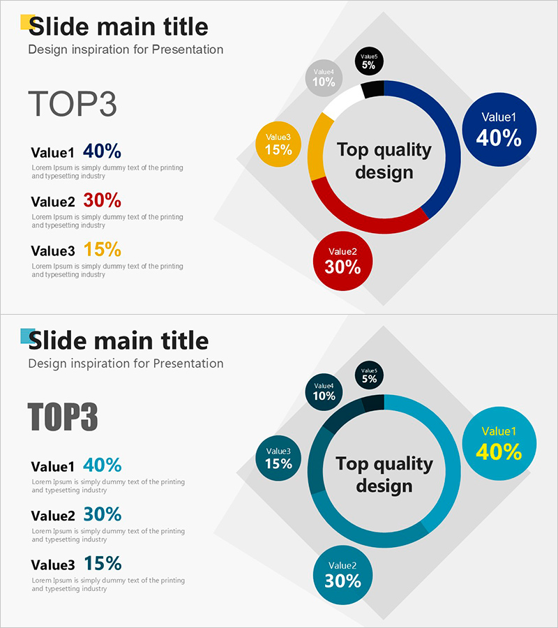
A PowerPoint slide featuring a donut chart that visualizes the ratio of TOP3 items with five segments. The center circular area displays a key message, while the outer donut chart represents composition percentages such as 40%, 30%, 15%, and more across five items. Five distinct colors—blue, red, yellow, gray, and black—differentiate each segment, with a left-side text area listing item names and numerical values. This layout effectively communicates market share, customer composition, budget allocation, and other ratio-based data in presentations, reports, and proposals. The 2-slide set provides color variations and is optimized for 16:9 widescreen format.
Usage Points
-
Main Usage
The donut chart is optimized for emphasizing the composition ratio of each item relative to the whole. By placing a key message or total figure in the center circular area, you can highlight critical information while the outer donut chart clearly displays segment-level percentages. It is ideal for visualizing market share, customer segmentation, budget distribution, sales channel proportion, and other ratio-based analytical data.
-
How to Use
Use this slide in the opening section of presentations to introduce market share or customer composition. In report data analysis sections, visualize budget allocation, sales channel distribution, and customer satisfaction composition. In planning documents, represent target customer ratios and investment allocation. Enhance audience comprehension by adding item names, figures, and descriptions to the left text area.
-
Recommended For
Marketing professionals, financial analysts, business executives, consultants, and strategic planners use this template when presenting market analysis, financial status, and customer insights. It is particularly suitable for executive briefings, investor presentations, and business plan pitches where ratio-based data must be communicated intuitively.
-
Slide Structure
The 2-slide set provides color variations. Each slide is divided into a left text area (displaying item names and values for Value1, Value2, Value3) and a right donut chart area. The donut chart segments five items (40%, 30%, 15%, 10%, 5%) in blue, red, yellow, gray, and black, with a center circular zone for key messages such as 'Top quality design.' Optimized for 16:9 widescreen format.
Related Products
-

Purple Brown Competitive Advantage Donut Graph – Visualizing Market Share
#Market and Competitor Analysis #Graph #Market Share
-

Graph of Environmental Pollution – Market Share Analysis
#Market and Competitor Analysis #Graph #Market Share
-

Travel Agency Market Share and Trends – Data Slide for Competitive Advantage
#Market and Competitor Analysis #Diagram #Graph
-

Sensuous Doughnut Chart Slide – Market Share Analysis
#Market and Competitor Analysis #Diagram #Graph
