3 Simple Free Donut Charts – Essential for Data Visualization
RJ0900004_26
- Last Update 08/16/2025
- File Size 0.4MB
- # of Slides 2
- File Format PPTX
- Slide Ratio 16:9
- Color
Keywords
About the Product
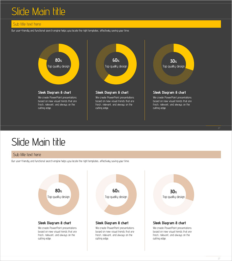
A set of three donut chart PowerPoint slides for intuitive data ratio visualization. Each slide displays different percentage compositions (80%, 60%, 30%) using circular graphs, ideal for reports and business presentations. Two design versions are included: one with a dark gray background and gold-toned charts for contrast, and another with a light beige background for a minimal aesthetic. All slides are fully editable and ready to integrate into your presentation materials for clear numerical data communication.
Usage Points
-
Main Usage
Used in business reports, financial presentations, and analytical documents to visually represent composition ratios and key performance indicators. The three different percentage configurations (80%, 60%, 30%) accommodate various data scenarios and effectively capture audience attention during presentations.
-
How to Use
Double-click on the numbers and labels in each donut chart to replace them with your own data. Color adjustments are straightforward, and you can choose between the dark background version for high contrast or the light background version depending on your presentation's overall tone and design scheme.
-
Recommended For
Financial analysts, marketing professionals, business executives, management consultants, and data analysts benefit most from these templates. Ideal for quarterly performance reports, market share analysis, budget allocation summaries, customer demographic breakdowns, and revenue distribution presentations.
-
Slide Structure
Two-slide set featuring dark gray background with gold-toned donut charts arranged vertically on the first slide, and light beige background with the same ratio charts arranged horizontally across three columns on the second slide. Each chart includes descriptive text areas below for data interpretation and context.
Related Products
-

Businessman Cartoon Theme Circle Graph – Market Analysis and Competitiveness
#Product/Service Introduction #Market and Competitor Analysis #Graph
-

Service Analysis Line Graph – Visualization of Competitive Advantage
#Market and Competitor Analysis #Diagram #Graph
-

Idea Development Analysis Chart – Data-Driven Innovation
#Product/Service Introduction #Business Introduction #Diagram
-

Compass Shape Circle Graph – Optimal Choice for Market and Competitor Analysis
#Market and Competitor Analysis #Graph #Market Analysis
