Analysis of Korean Traditional Charts – Visualizing Market Share with Diagrams
RJ0800050_7
- Last Update 08/14/2025
- File Size 1MB
- # of Slides 2
- File Format PPTX
- Slide Ratio 16:9
- Color
Keywords
About the Product
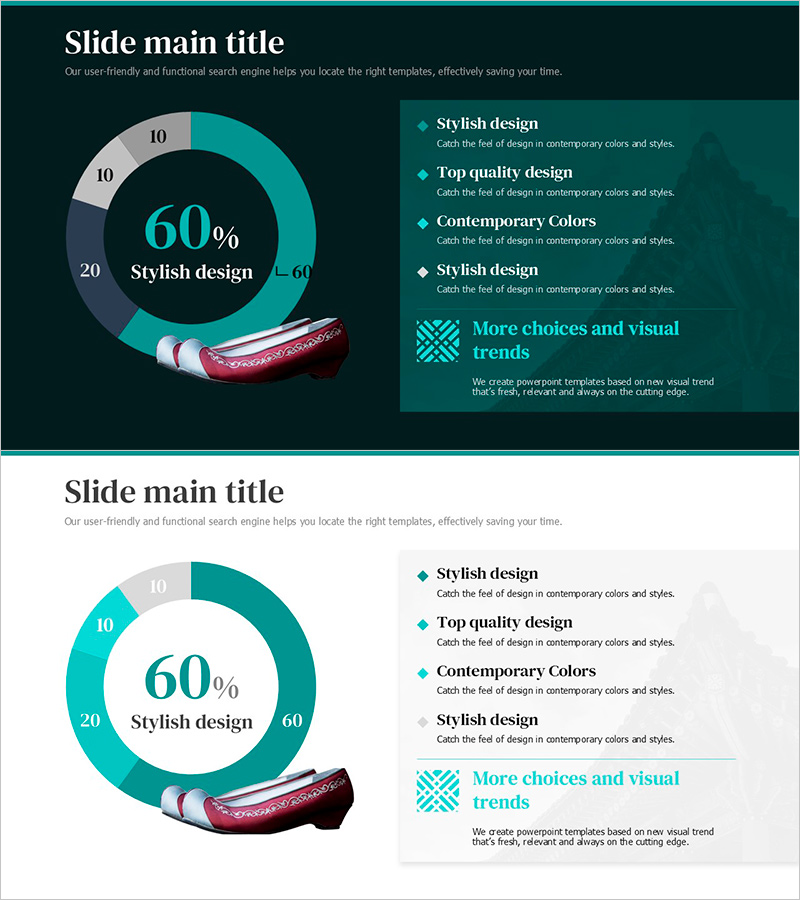
A donut chart PowerPoint slide that visualizes market share and business data with intuitive clarity. The design emphasizes the central metric (60%) while arranging four surrounding segments (10%, 20%, 60%) to enable instant comparison and ratio analysis. The teal and light gray two-tone color scheme distinctly separates data layers, with text boxes and icons on the right side for detailed explanations of each segment. The 2-slide set includes both dark and light background versions, allowing you to choose based on your presentation environment. This slide deck is ready to use in business presentations, reports, marketing plans, and investor pitches.
Usage Points
-
Main Usage
Clearly express proportions of market share, sales ratios, customer composition, and budget allocation as parts of a whole. By emphasizing the central metric while displaying each segment's proportion, this slide effectively communicates data in executive reports, investor presentations, and market analysis.
-
How to Use
Click each donut segment to edit values and labels. Add descriptions, strategies, and insights in the right-side text boxes, and insert icons to enhance visual emphasis. The dark background version conveys premium positioning, while the light version prioritizes information clarity.
-
Recommended For
Finance managers, marketing professionals, executives, consultants, and sales teams explaining quarterly performance, customer segmentation, budget status, and competitive positioning. Ideal for business plans, quarterly reports, investor pitches, and proposals.
-
Slide Structure
2-slide set. Each slide features a donut chart with central 60% metric and four surrounding segments (10%, 10%, 20%, 60%), paired with a right-side text explanation area for four items. Teal accent and gray neutral colors differentiate data layers, with arrows and icons connecting each segment to its description.
Related Products
-

Fashion Design Comparative Donut Chart – Market Share Analysis
#Market and Competitor Analysis #Graph #Market Share
-

Travel Destination Infographic Market Share – Intuitive Data Visualization
#Market and Competitor Analysis #Graph #Market Share
-

Recent Market Status Slide with Donut Chart
#Market and Competitor Analysis #Graph #Market Status
-

Camping Tools Infographic Donut Chart – Market Share Analysis
#Market and Competitor Analysis #Graph #Market Status
